Do I qualify as an official member of “The Craftsman” magazine’s Home Builders Club if the house #99 I am constructing (published in the “The Craftsman”, October 1910, issue) is in 1:12 scale (one inch to one foot)? Does total time invested count? I am beginning year number six, and I am betting most club members finished their projects in less time with Stickley’s thorough plans which I wish I had on hand. It all started in 2017 when the inspiration hit me. At first were the dreams, scale drawings, graph paper, calculator, pencils, erasers and rulers that covered my dining room table and forced us to eat dinner for months on the kitchen counter.

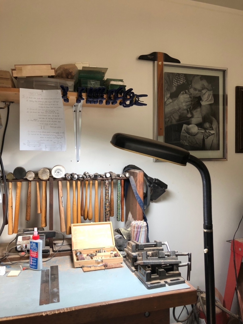
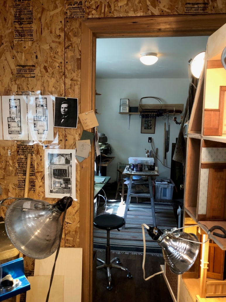
In the winter of 2018, my husband, Gary, helped me build the basic “carcass” in his wood shop with very little heat and a lot of trips to the kitchen to hold cold hands under the hot water tap (see “Building the Shell” post). Later it took four guys to carry my house down the hill to my workshop, remove the shop door to get it in and position the structure on a temporary table with no top so that the house could be accessed from underneath. For a while now, I have wanted to show where it is all taking shape, my shop, my most happy place, where hours spent there can feel like meditation. Truly, there is a lot more to be done, but maybe I can proclaim that the structure and interior woodwork are on the home stretch. Electricity, more furniture, and accessories to follow…for two more years (?).
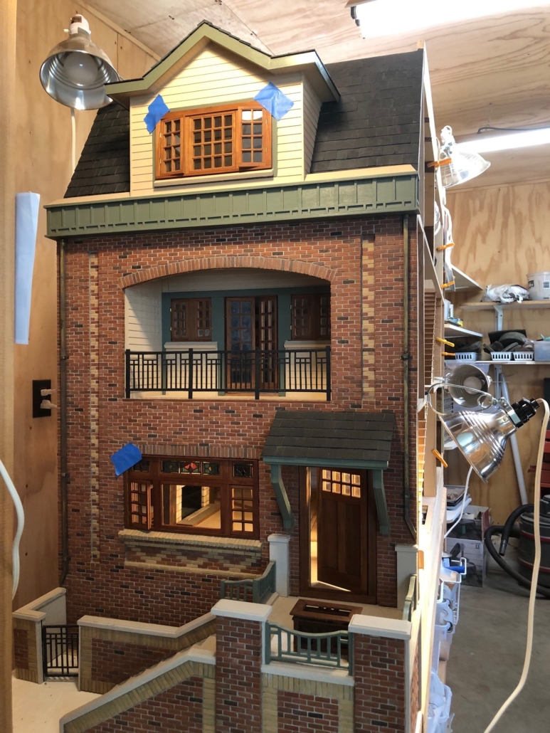
Complete Facade

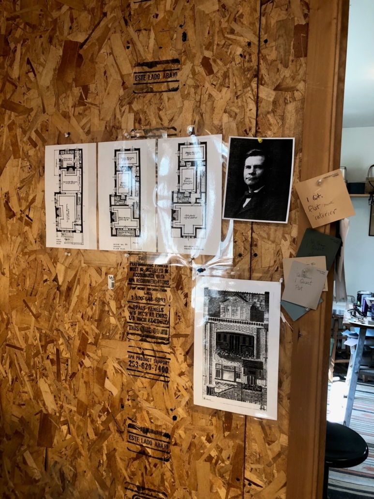
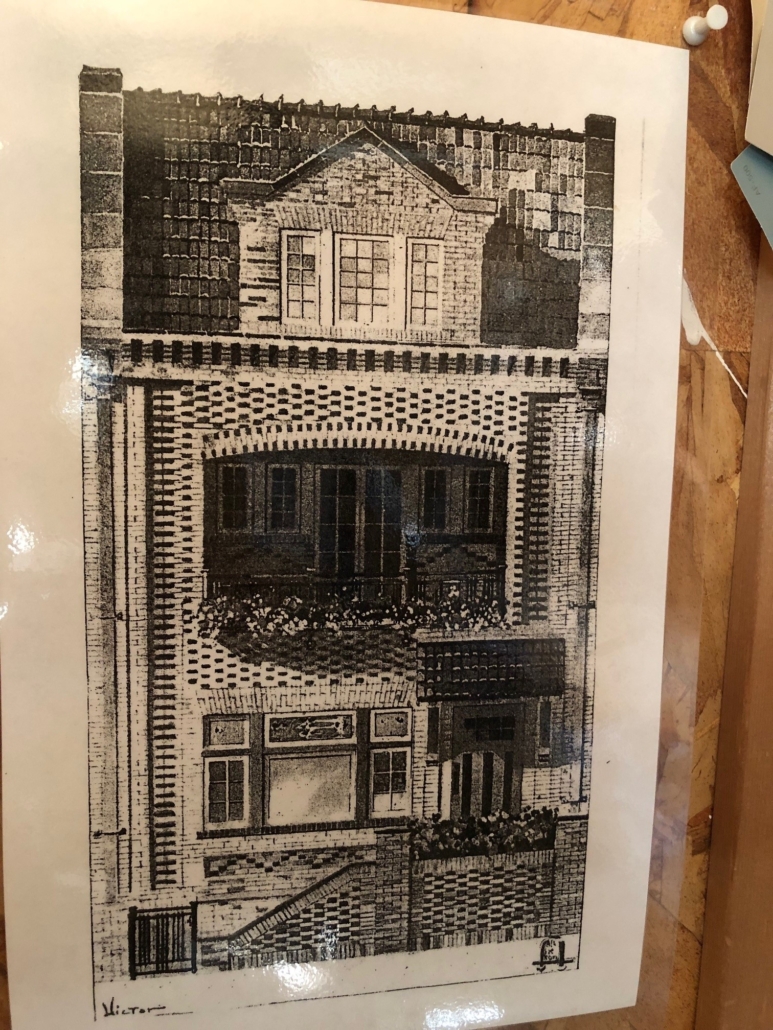
This is the illustration from “The Craftsman”, October 1910, that caught my eye. The house is designed to be built on a city lot, 25′ wide, in the middle of the block (a row house), with neighboring buildings on both sides, a HUGE departure from Stickley’s more common bungalows. That 25′ specific is the only dimension I had to determine the dimensions of the rest of the facade. The three floor plans included in the magazine had some dimensions and one bedroom elevation which helped with drafting the interior. With one “party wall” (a shared wall with the neighboring building), windows on the opposite side of the house can look out over a narrow breezeway/court between the house and its neighbor. Leaving the party wall open was the perfect design for a model house, and the narrow structure had few rooms one behind another, also perfect for a model house. With that in mind, I eliminated the butler’s pantry to open up the kitchen and a couple walls on the second and third floor landings around the stairs for more visibility.

Still a dilemma, the second-floor master bedroom is enclosed in a wall around the stairwell. That wall makes perfect sense in real life but in my house, it would block the view of the bedroom and its furniture and accessories, so it has to go. A “pony wall” would not be realistic for a main bedroom that opens to the lower floor. So how to “suggest” a wall but allow visibility into the room??? There is always something yet to be decided.
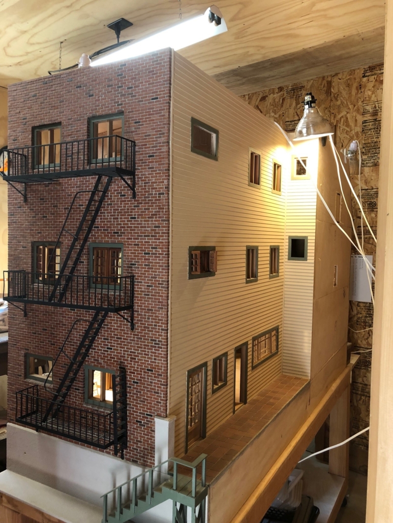
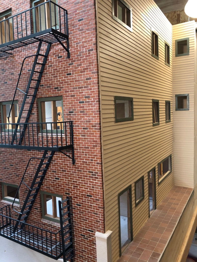
Alley/Breezeway Between City House and Neighbor Provides More Windows and doors from the kitchen and dining room

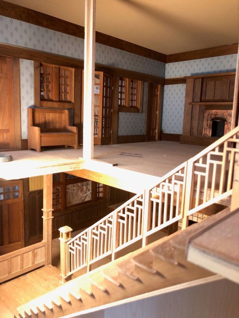
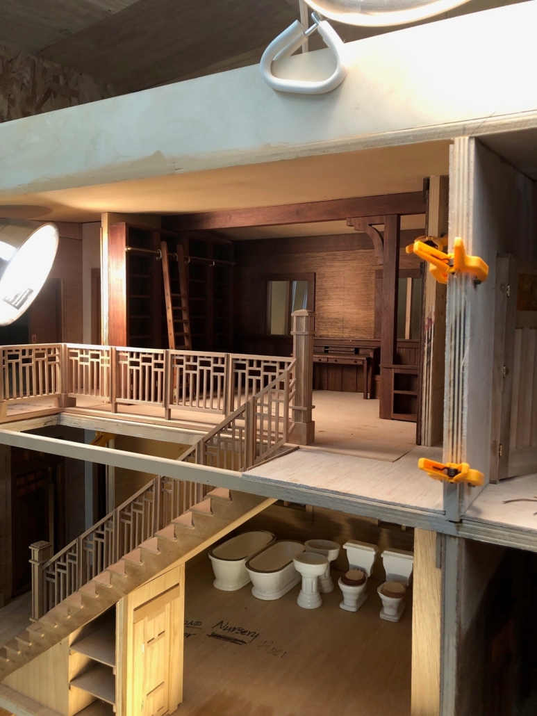
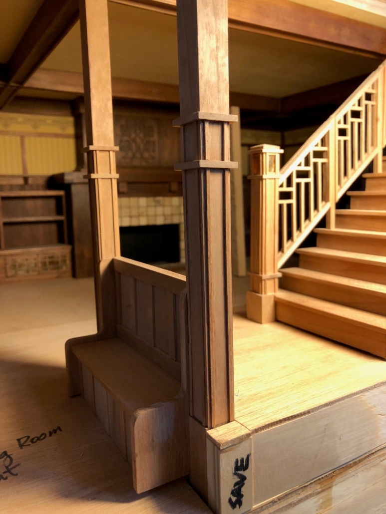
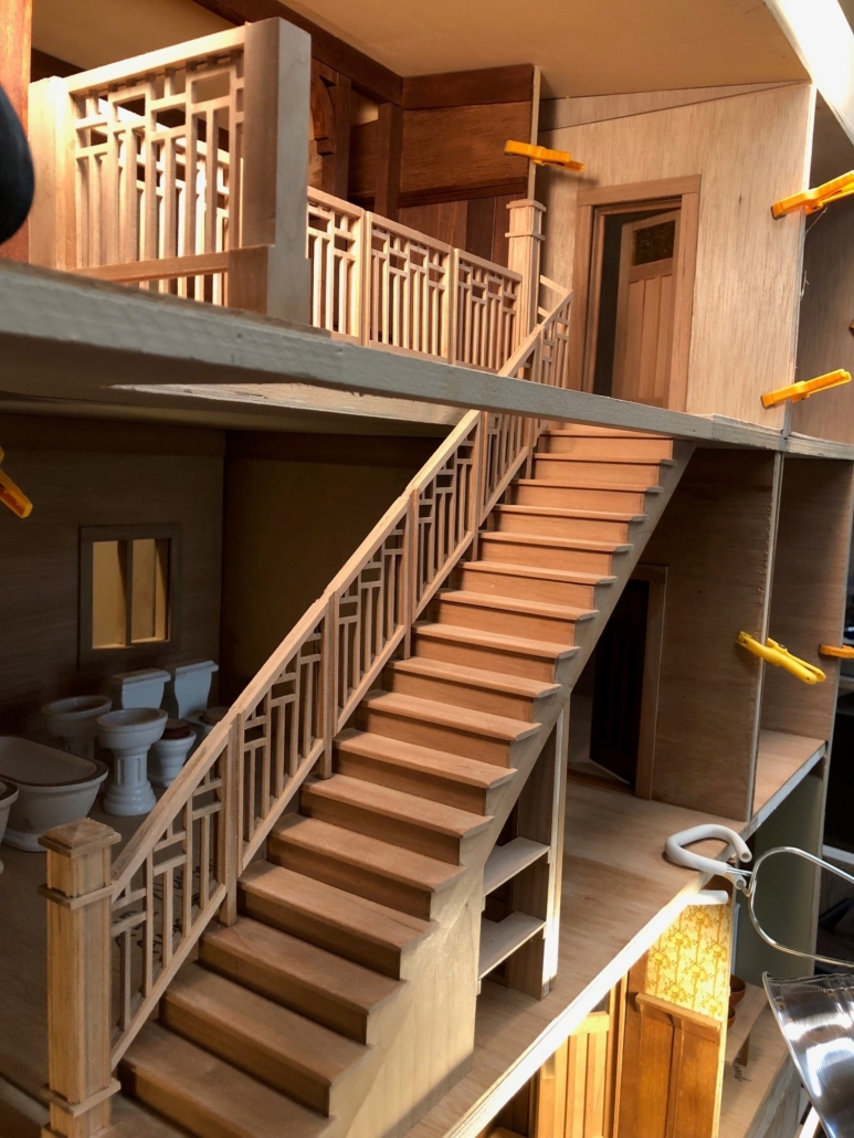
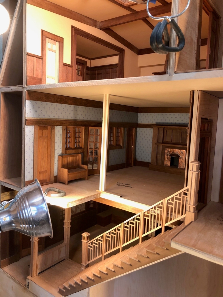
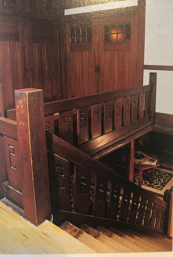
Another dilemma: there are two large staircases going from the main floor to the second floor and from the second to the third. The question of baluster design gave me countless hard-to-go-to-sleep nights. So many doll houses have a stairway with treads that are too shallow, risers too high and a pitch too steep. Just plain uncomfortable, unnatural and dangerous looking. I wanted my staircases to look and “feel” realistic. With the help of stair builders’ handbooks and some trigonometry, I came up with the correct stringers for both stairways and for the stairs going down to the basement and going up onto the porch landing and the front door. Who would have thunk it: that high school trig class actually came in handy. Because the two interior staircases are against the shared wall of the neighboring building (that wall I have chosen to remove), the balusters of both stairways have to be rather light weight to allow visibility into the rooms behind. Problem: typical Craftsman stairway designs tend to be heavy. I think of the one in Gustav Stickley’s log house at Craftsman Farms. Heavy wood panels with the initial “S” cut out, few inches between them, are all strung between heavy square newel posts with no ornamentation. Maybe I could cut the balusters from metal making any delicate spindles stronger? No, metal is not appropriate for the era. Instead, I decided to cut a simple design in sections from 1/8″ cherry stock with my jewelers saw. Between the sections are plain support posts with more ornate starting and landing newel posts (that I found on Pinterest for inspiration) at the bottom and top of the balustrade. The newel post on the landing in the living room will even have a lamp on the top inside a mica light box! The handrail is now a question and something to lose more sleep over (?)!
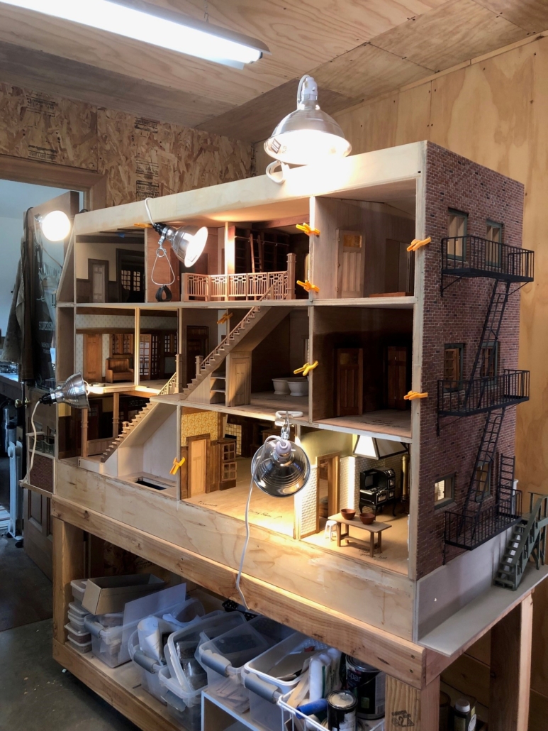
Open Side of House
A Photograph of the Main Staircase from “Gustav Stickley’s Craftsman Farms – The Quest for an Arts and Crafts Utopia” by Mark Alan Hewitt

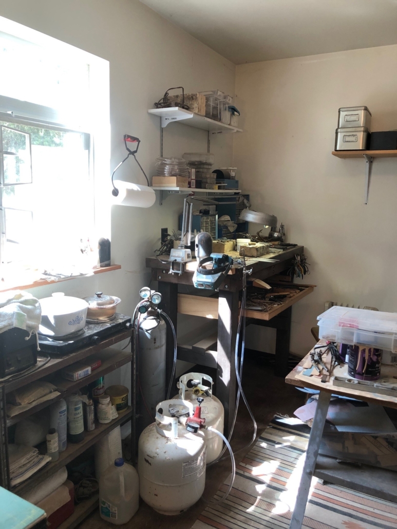
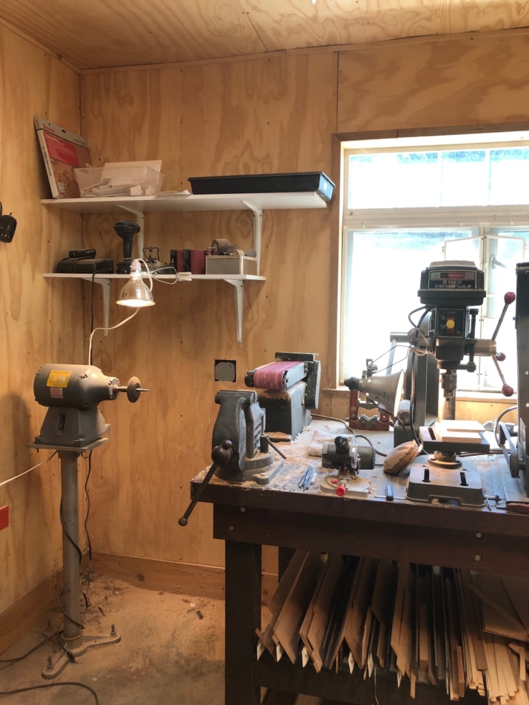
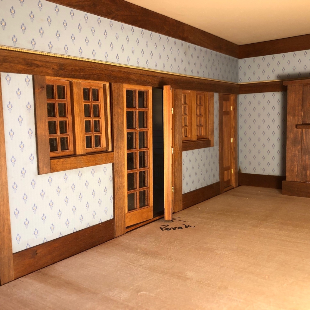
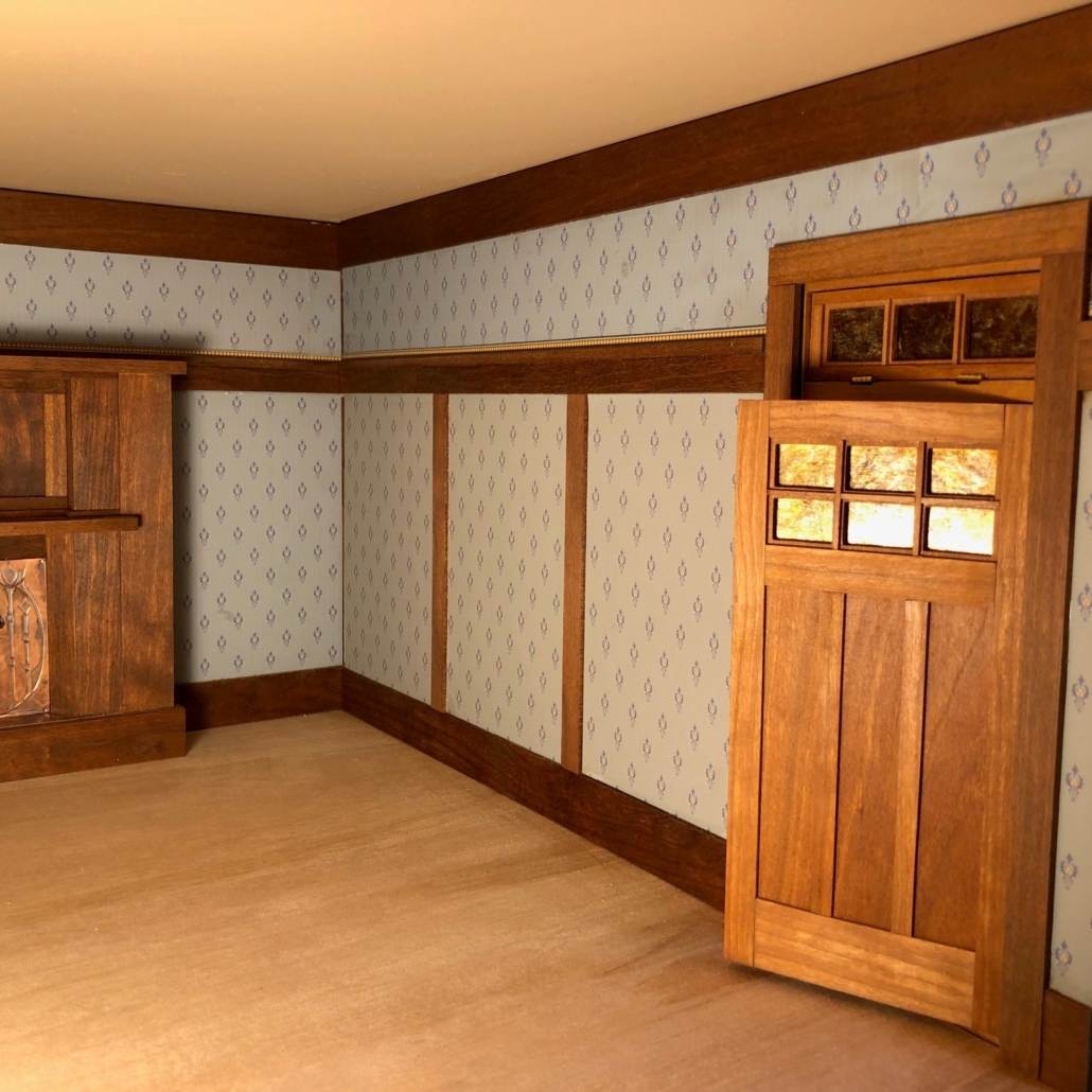
The following are photos of the City House progress and some shots of my shop, tools, and supplies.
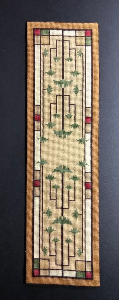
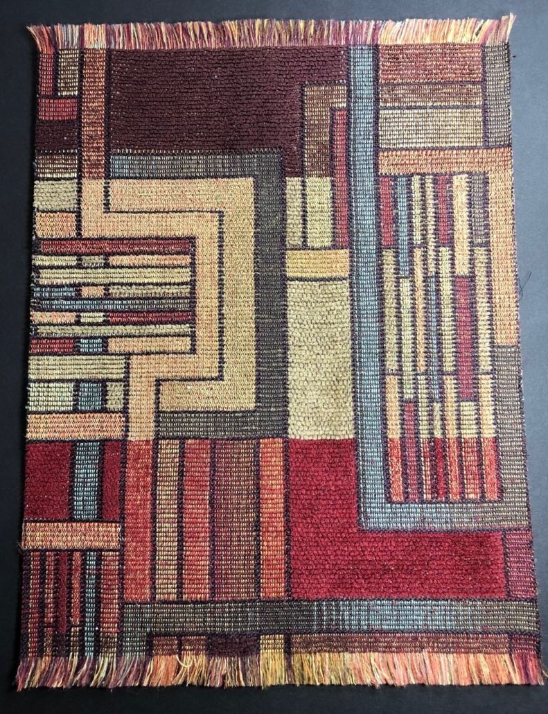
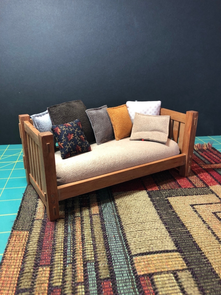
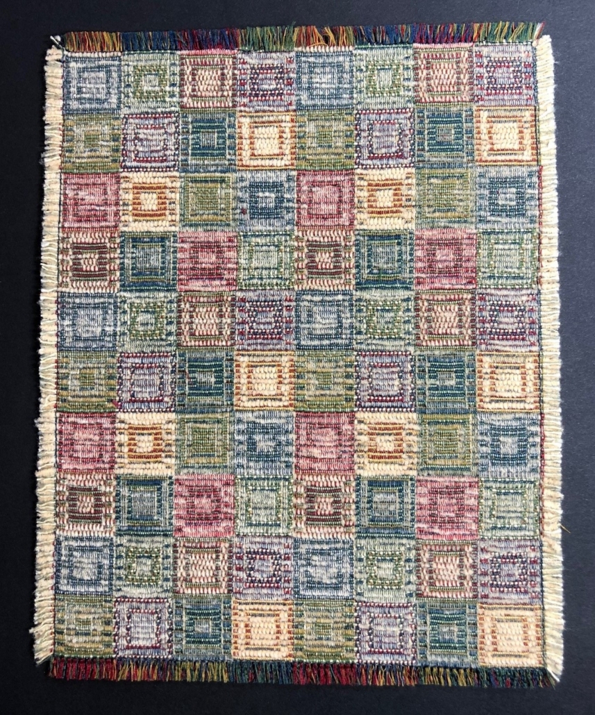
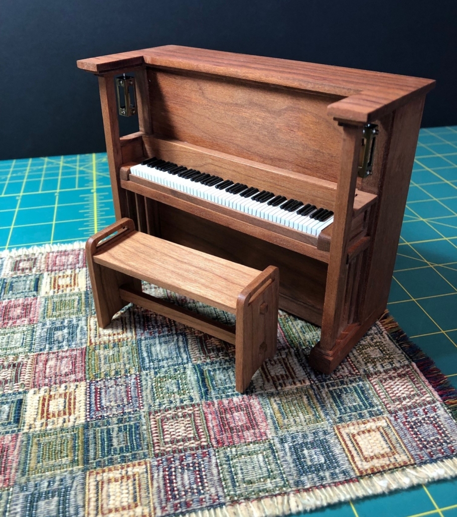
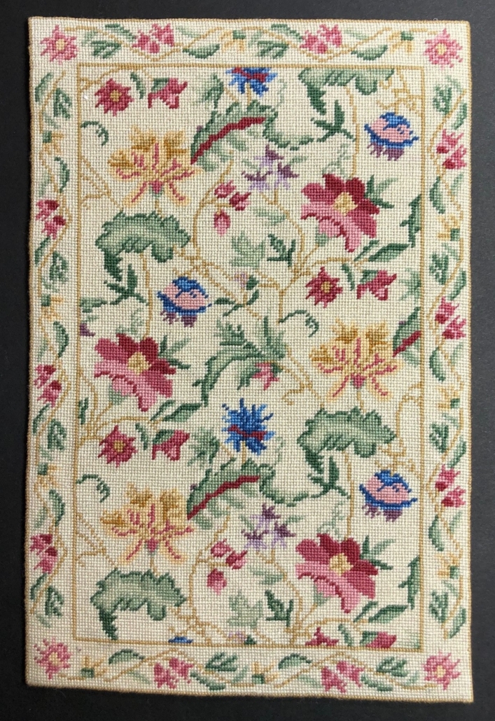
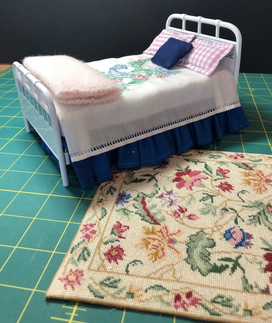
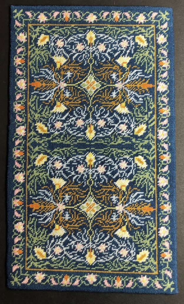
With so much of the flooring in the house incomplete (or not even started!), it’s hard to begin imagining the rugs those floors will eventually need.  But for the past couple years, I’ve been creating some needlepoint prospects with great hopes (they’re fun but take enormous time) and collecting upholstery samples with the thought that some of them might fit those spaces that will require the soft touch of a rug. Upholstery fabric suppliers will usually offer a swatch of about 12” square for a small fee and some begging (the swatches are usually 6” square). I continue to check out home-dec departments at JoAnn’s etc. to find something that might work. Scale is important and can be deceiving. Here are photos of my progress in my rug search so far.

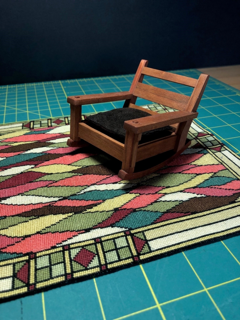
Stickley Rocker on My Original Wild Rug

I saw a rug like this on Pinterest a while ago and liked it. However, learning that Gustav took “great pains to find the kind of rug that will harmonize in character as well as color with the complete scheme of Craftsman furnishings”, I fear he may have rejected this one. He thought a rug should be “unobtrusive in design, so that it helps to give a quiet and harmonious background to the furnishings of the room”. The coloring “should be soft and subdued”, leafy greens and browns similar to the color of his furniture and the home’s woodwork. The material should be “high grade wool” and “finished with a thick firm pile” that is “in keeping with the sturdy fiber and dull mellow surface of the wood”.

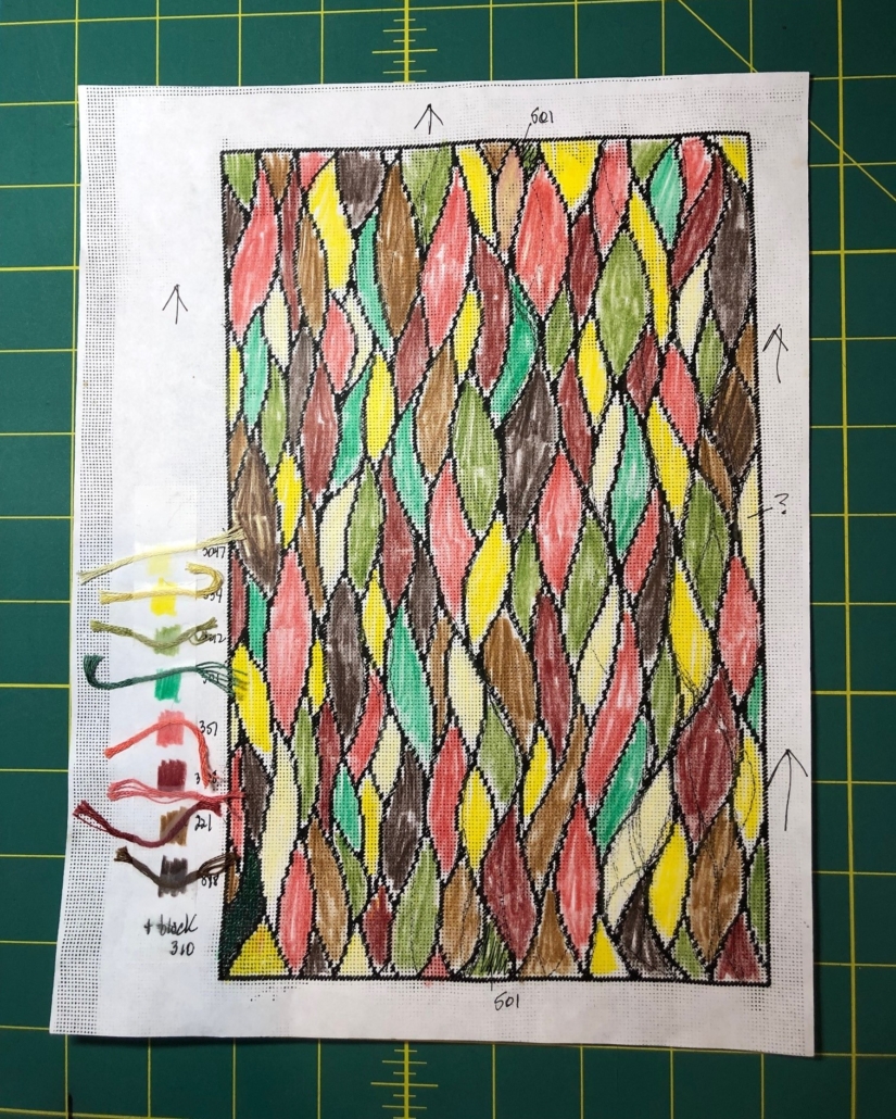
This is my design for the (wild) needlepoint rug. Some changes evolved in progress, and I added the border design later. I stitch on 28 count canvas with regular DMC embroidery floss. With stitches that tiny, even a small area rug can be a lengthy project. Below are more examples of rugs I may or may not end up using. To balance the labor intensive needlepoints are nice rugs made from upholstery fabric supply swatches.

A recent article in The New Yorker about a man who has long been planning to write a book but has yet to write a word is titled “I’ll start this new project just as soon as all conditions in my life are perfect.” It has been months since I last posted on this site, and I’m tempted to use that same excuse, at least for my lack of new posts. However, rocky 2021 life (and it was!) didn’t slow me down with making progress on the structural interiors of my little house and more of its furnishings. I accomplished a lot and will load a group of photos here with brief descriptions to get caught up.

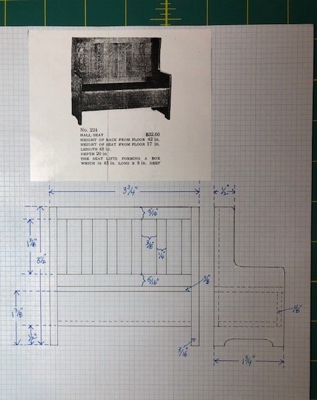
Hall Seat Plan; this is typical of the drawings I do in preparation for making a piece of furniture. Things could change mid-production, but I like having a guide to begin with. The dimensions are taken from Stickley’s furniture catalogs and converted into 1:12 scale, 1 inch = 1 foot, with a few minor exceptions.
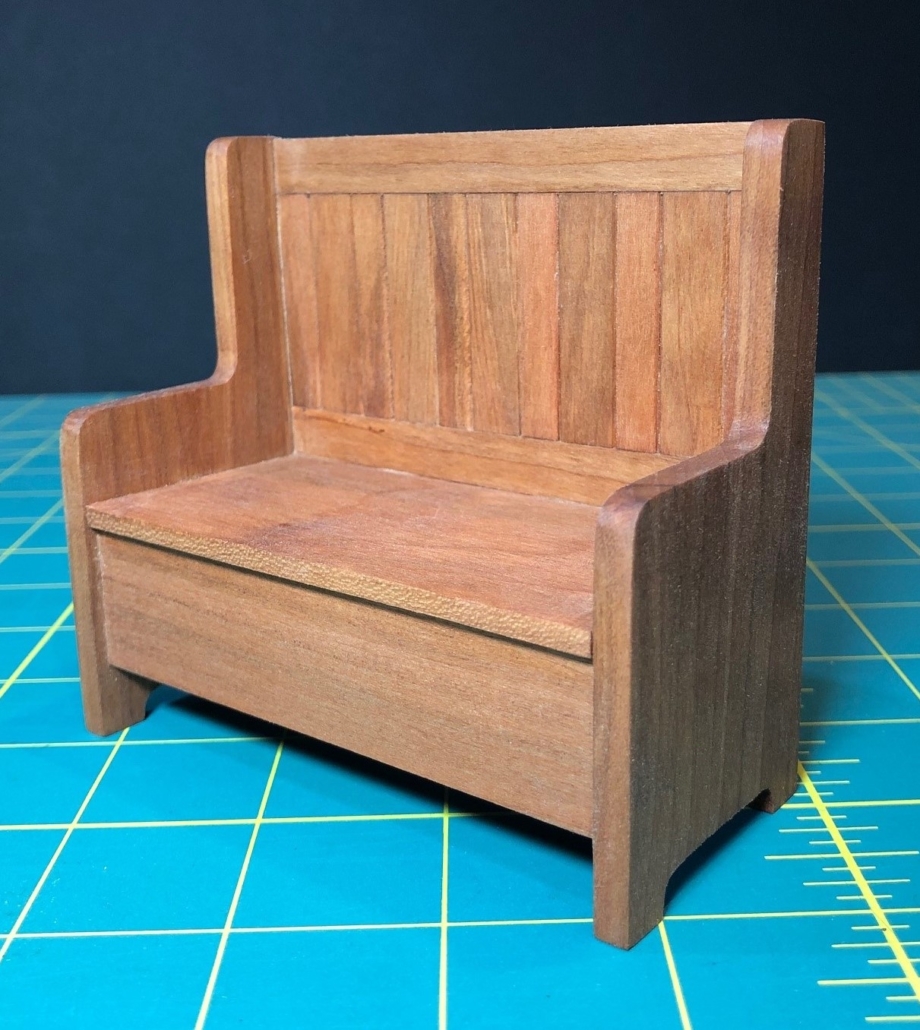
Hall Seat, #224 ($32.00) was designed to have a storage box below when the seat was lifted. The piece will go in my master bedroom.
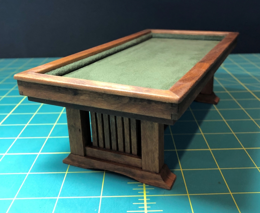
Complete billiard table ready for the third floor studio. I designed this table inspired by a Craftsman-style pool table I found online. Billiard tables have no pockets. Billiards was a more popular game than pool in the early 1900’s. It uses 3 balls and standard cue sticks, and I’m guessing it might have been more likely to be in this 1915 game room. My table will soon be joined by a group of billiard chairs (Stickley design), high enough to watch the action.
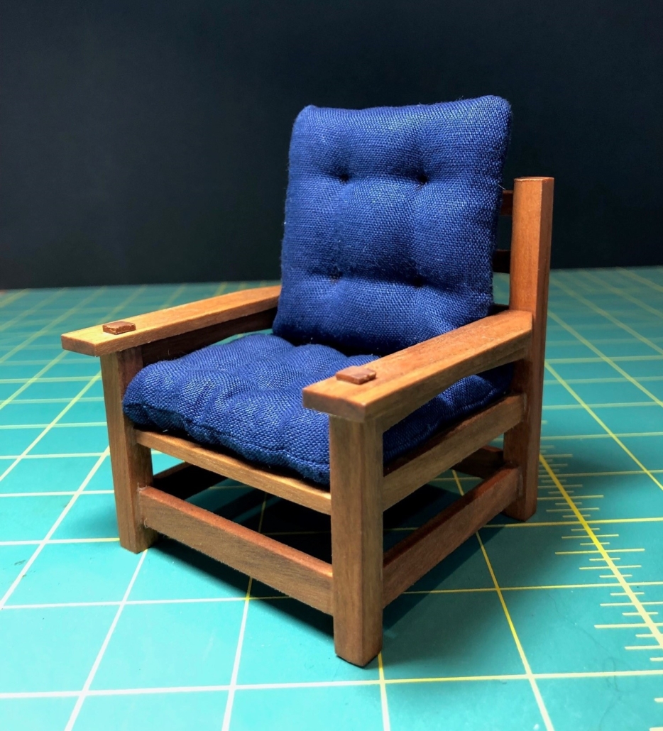
“Eastwood Chair” complete with cushions. This chair was originally cushioned with the choice of leather, sheepskin or velour
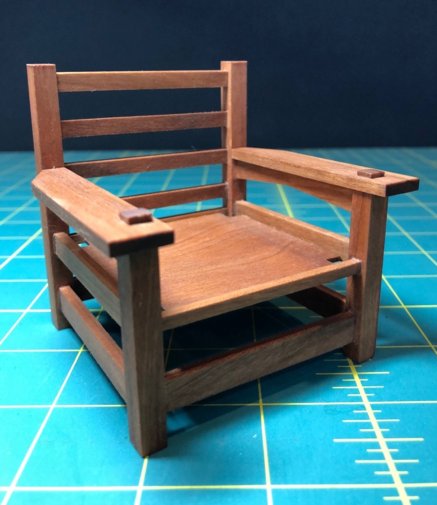
“Eastwood Chair” minus cushions. A beefy creation!! In fact it was the biggest chair Stickley ever made. It first appeared in 1901 and continued to be made for 12 more years. This chair must have been one of Stickley’s favorites because he had one in his own home in Syracuse., NY. This one will go in my master bedroom.
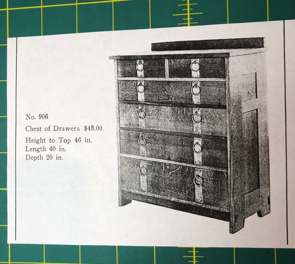
Original catalog entry (1910) for chest of drawers #906 with banded hardware. Note the price!!! Gustav complained that bedroom furniture was too often just extra items collected by homeowner and tossed into bedrooms. He was a trail blazer in designing furniture expressly for the bedroom.
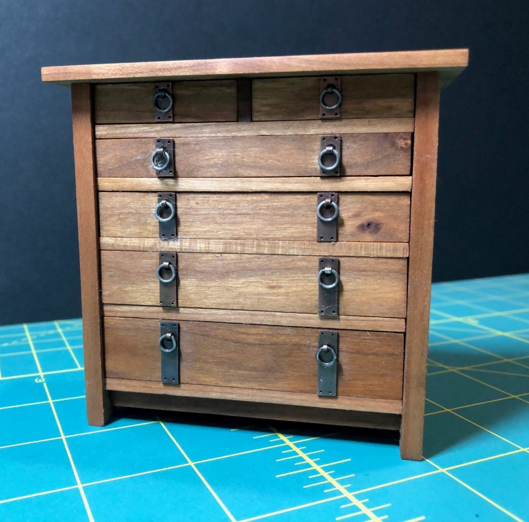
Master bedroom chest of drawers #906. The size and design of this bedroom dresser is similar to earlier versions. But in 1910, Gustav introduced the heavy banded hardware with large ring pulls. This model disappeared in 1912. A hundred and ten years later, I still love it.
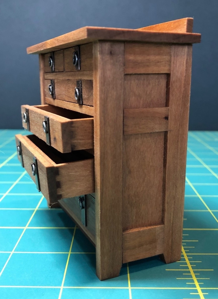
Chest of drawers showing drawers with “dovetailed” joinery. My dovetails are not angled like true dovetails but still require some tricky fitting and strengthen drawer structure.
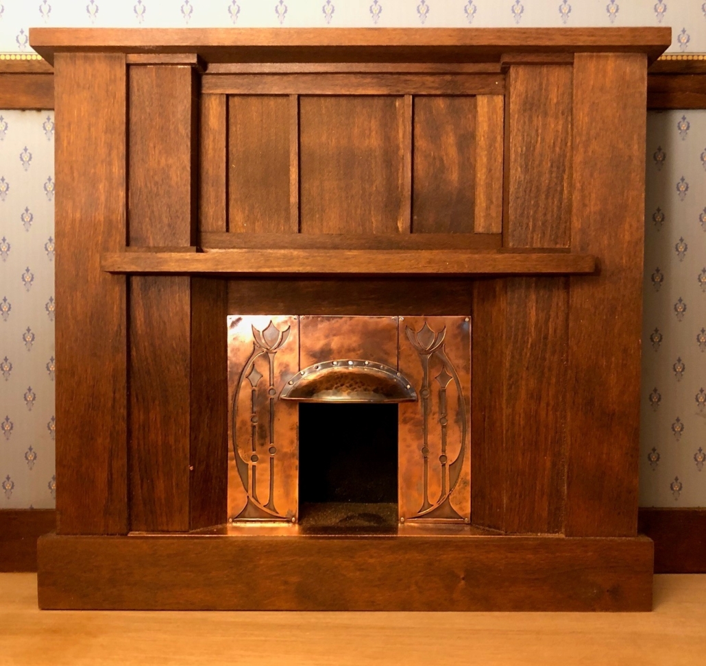
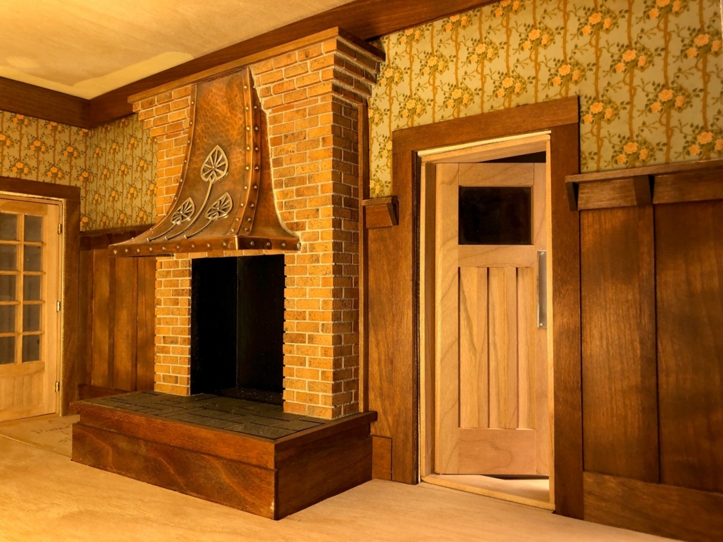
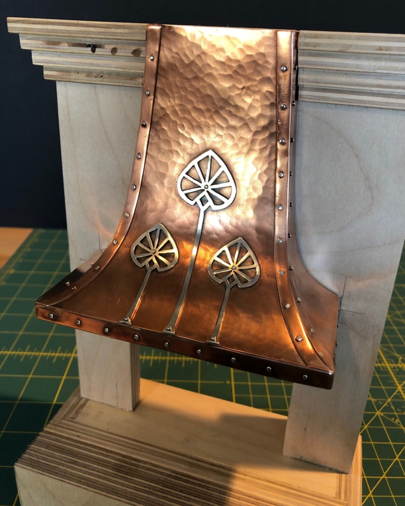
Master bedroom fireplace, copper with hand-made copper hood, rather Art Nouveau in design. (My favorite…sorry Gustav!) The three panels above the mantle will eventually be filled with mirrors with chamfered edges.
Master bedroom French doors access second floor balcony on the front façade of the house above the street. There are two walk-in closets on either side with full length mirrors on their doors to be added later. The closet to the left of the French doors will be on the open side of the house and show the lady of the home’s clothes hanging inside, hats and shoes on the shelves!
Master bedroom door with transom above, opens to a large foyer with a full bath, nursery and child’s bedroom. Master bed and bed tables will occupy the wall next to the door, close enough to feel the warmth of the fireplace that is slightly raised above the floor level to project the warmth better.
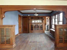
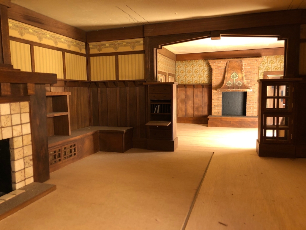
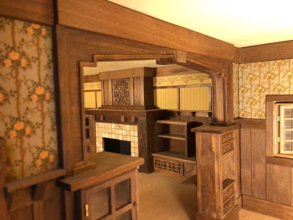
View of dining room from living room through the colonnade. Cabinet on right side of colonnade is for china, accessible from both the living room and dining room. On left side is a small writing desk that folds up when not in use. Seats on either side of the fireplace will be cushioned and full of pillows.
View through colonnade from dining room to living room. Shelving next to the fireplace will be full of books.
Colonnade Inspiration – a photo I found on Pinterest.
Finished dining room fireplace. To see the process of making this fireplace hood, check out “The Dining Room Fireplace” post. Covid-19 delayed delivery of these bricks for more than a year. The swinging door next to the fireplace is the entrance to the kitchen.
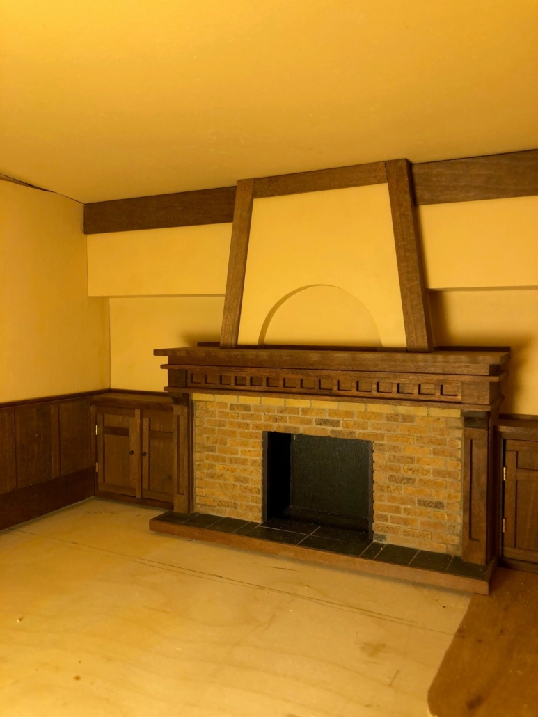
Fireplace in third floor studio/game room. The ceiling in this room is slightly vaulted and will have ceiling beams radiating out from the fireplace. Between the beams will be an ornate skylight open to light coming from above the third floor roof.
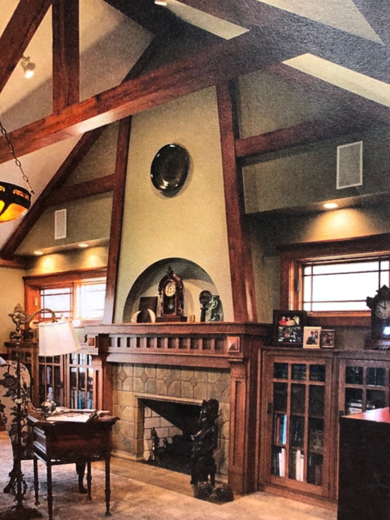
Inspiration for the fireplace in the third floor studio/game room. I found this photo on Pinterest.
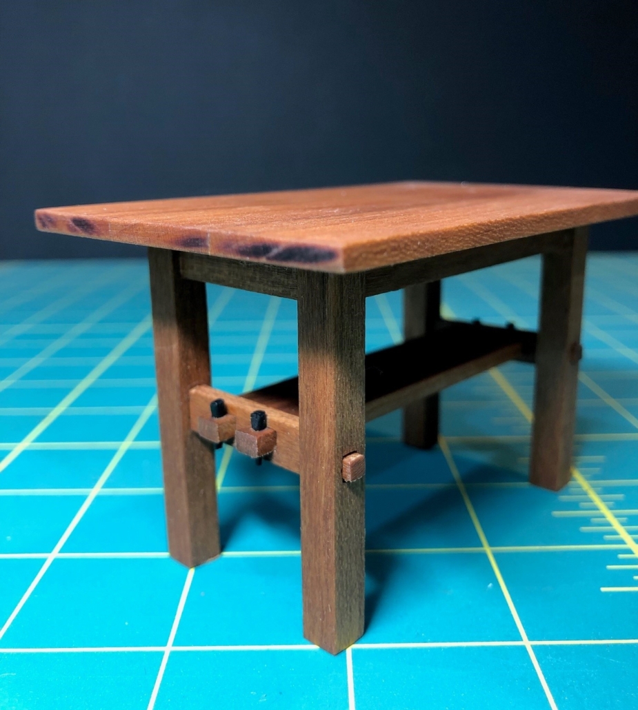
I call this a rectangular occasional table. Stickley’s tables were either “library” or “dining for the most part. This table #651 is just listed as “Wood Table” in the catalog with either wood or leather top. I used it to practice mortise and tenon joinery, not easy with those beefy legs! I think this table will go into one of the children’s rooms. TBD!
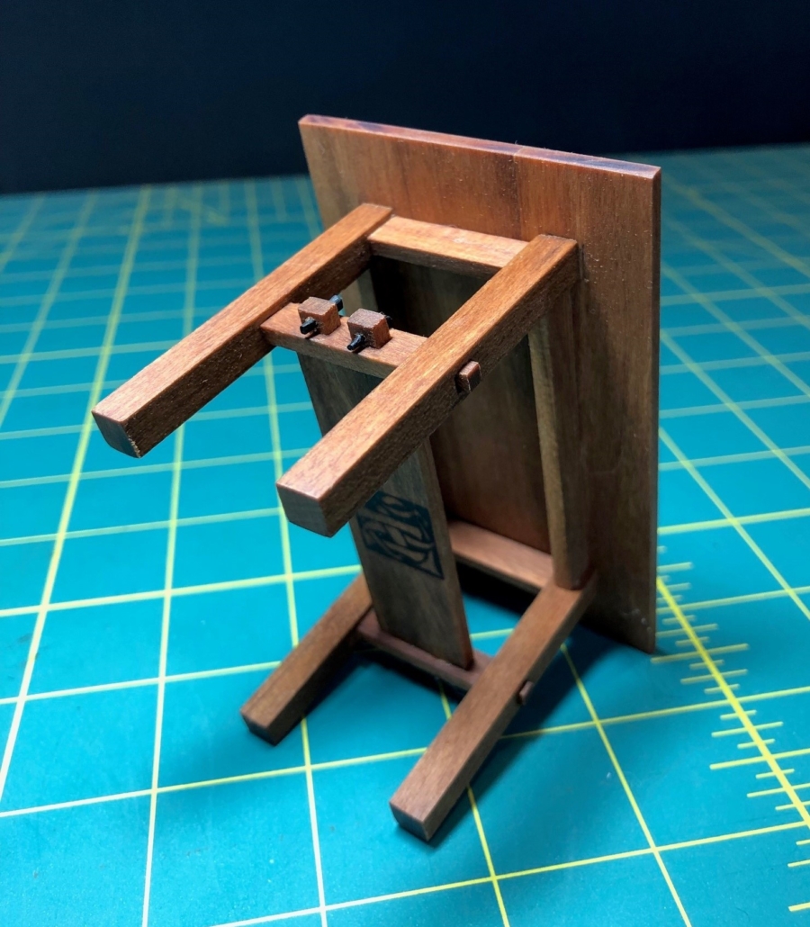
Rectangular table showing close up of mortise and tenon joinery and a peek at my wood burned hallmark underneath.
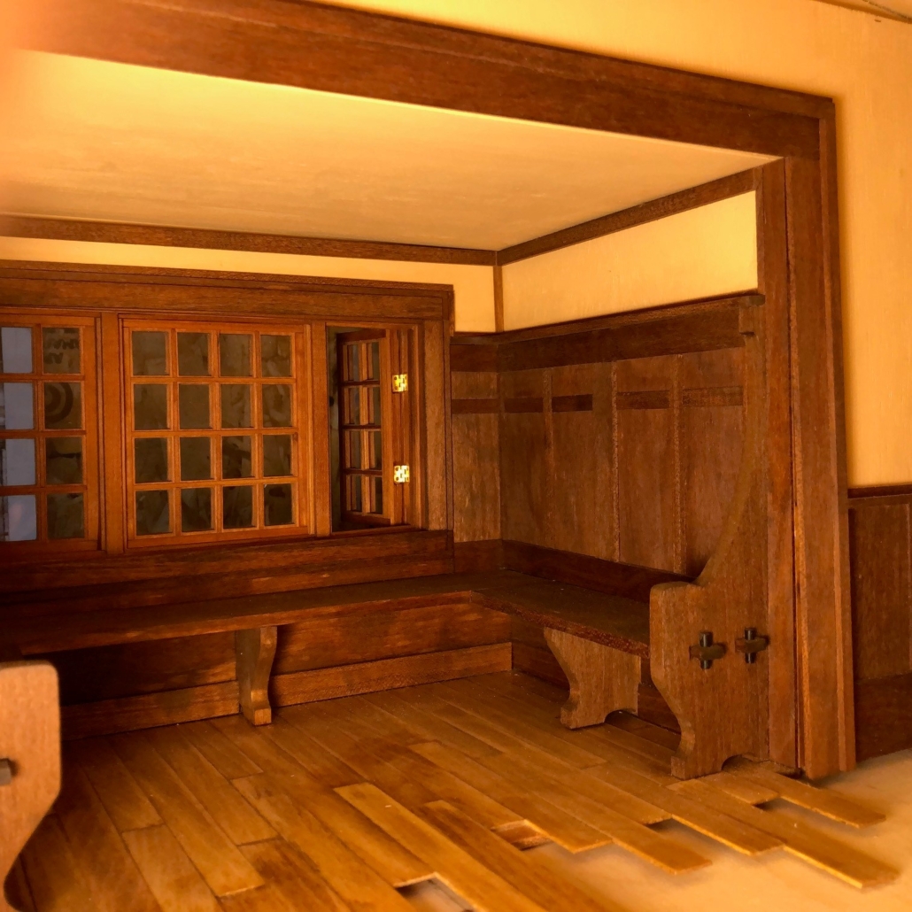
Third floor inglenook under construction. Seats will later have cushions and lots of pillows, of course. This inglenook is located under the dormer on the street side of the house.
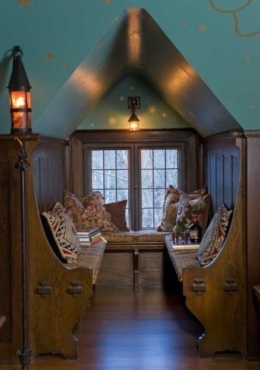
Magazine photo that inspired 3rd floor inglenook design.

Maybe it’s my fatigue from our Covid-19 Thanksgiving (no family), Covid-19 Christmas (no parties, no family). Ditto for New Year’s, Superbowl, Valentines Day… I put aside the wood, bricks, tiles, glass, stones, metals and retreated to my sewing studio with fabrics, embroidery thread and my sewing machine. 

Girl’s bed Close Up
Girl’s Bed Dressed
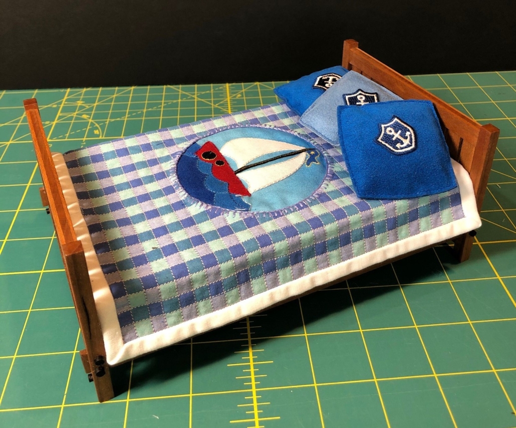
Boy’s Bed Dressed; the young boy who lives in my house is crazy about boats.
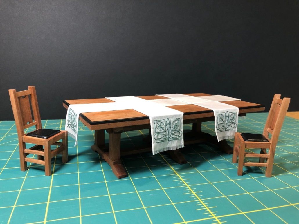
Dining Table with Popular Craftsman Arrangement of Overlapping Linen Scarves
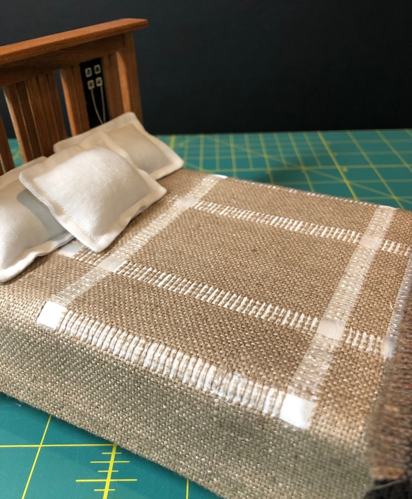
Master Bed Dressed

All the now constructed beds needed to be finished with dressings, pillows, and the dining room table needed those classic Arts & Crafts overlapping table runners I’ve been picturing for months. The photos here are the results. “Softscape”?

Master Bed Spread Detail – Pulled Threads from Silk With Silk Ribbon Insertion

In 1909, Stickley published a compendium of what he considered the best of the houses designed in his workshops and published in the last five years of “The Craftsman” magazine. They range from simple little cottages to large, expensive homes with farm houses, vacation homes and “mountain camps” thrown in as well. However, they are “craftsman”, of course, designed with low maintenance, durability, spacious interiors, liberal use of wood, warmth of colors, structural built-in features and emphasis on charm in mind. Per Stickley, each room must seem complete before a single piece of furniture is added.

In his compendium, he goes to great lengths to describe living rooms, dining rooms, halls and stairways, wall treatments, fabrics, and of course furniture without a single word about “sleeping rooms” as he called them. There are three bedrooms in my city house. Two are plain rooms with casement windows that open up to the rear alley behind the house near the fire escape and to the narrow breezeway between my house and the neighboring building. The master bedroom, though, opens out through French doors to the charming “sleeping porch” (balcony) on the second floor above the main street. Details of how to decorate these rooms has been left entirely up to me.

Stickley Knock Down Daybed

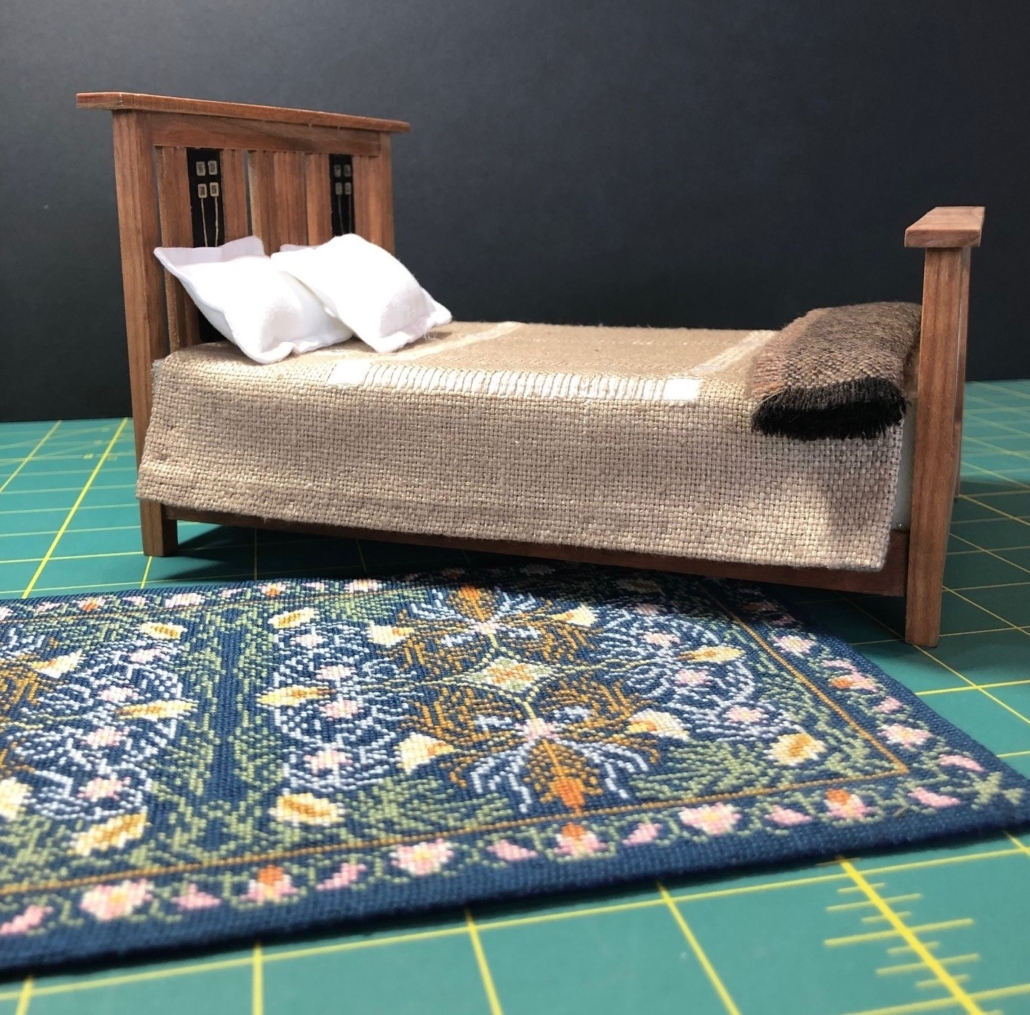
I started with the beds. Stickley furniture catalogs include few beds and all very basic, but I did use the dimensions that are specified there for three widths. The one design I did copy is the “Knock Down Daybed”. It was shipped in pieces and left assembly to the buyer. (A la Ikea!! Stickley was ahead of the curve…again! and only a few tools were required.)

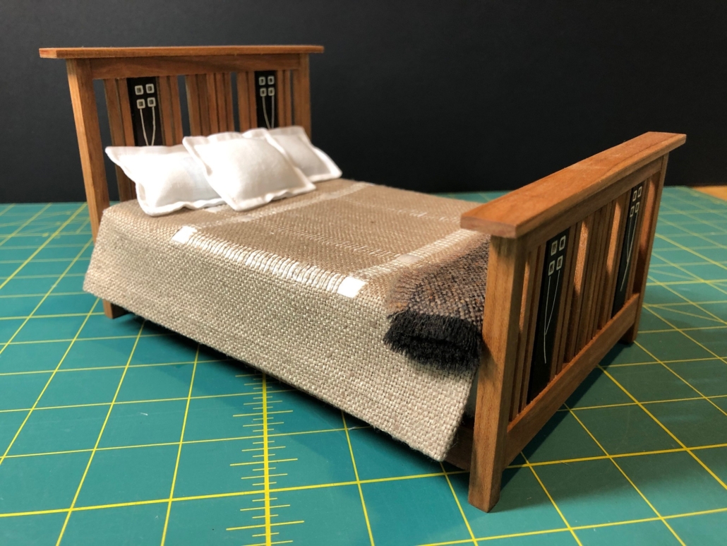
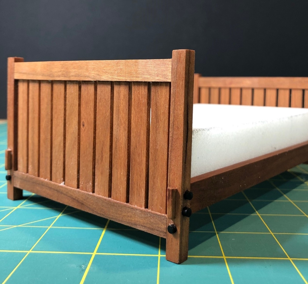
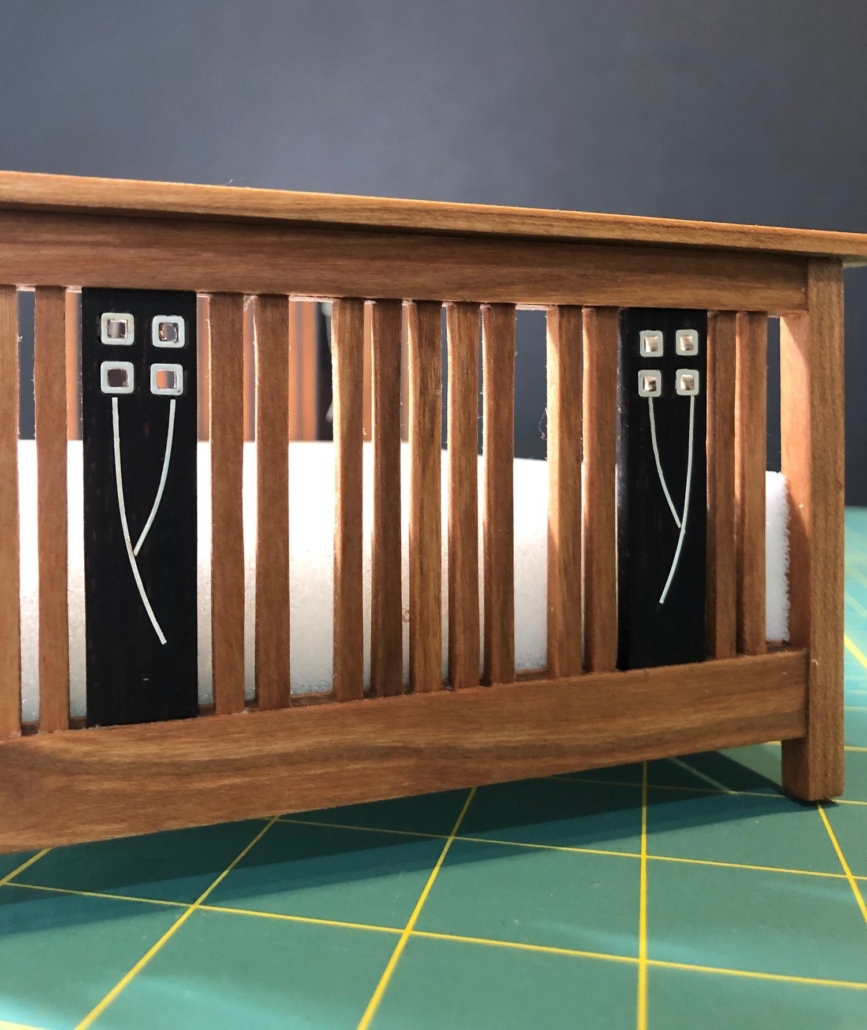
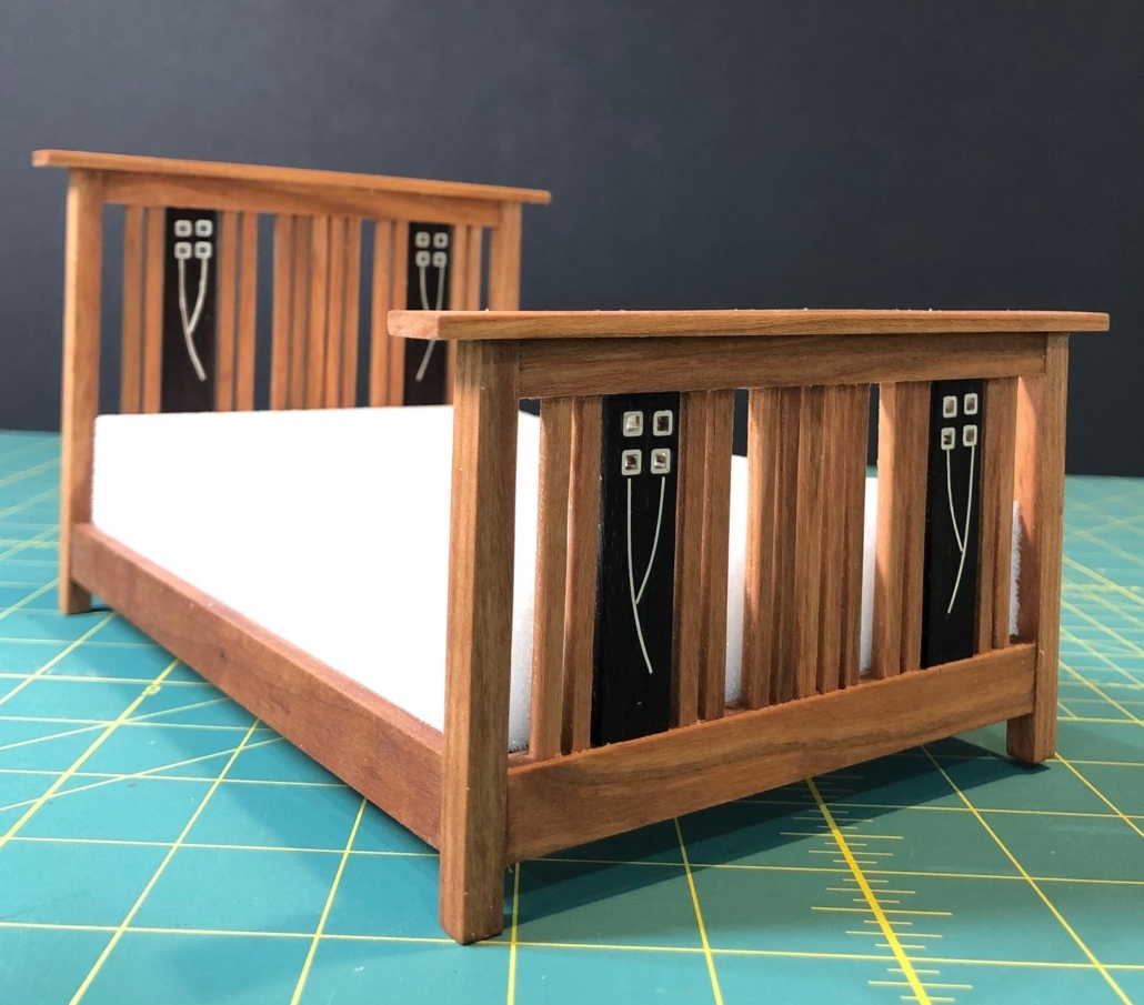
The master bedroom bed is my design, Craftsman in feeling but a little departure from the “absolutely plain and unornamented” severity that Stickley professed. Harvey Ellis, who worked with the Craftsman Workshops briefly until he died in 1904, added his gorgeous inlay designs that lightened up some classic Stickley pieces. None of his designs were ever added to the general catalog for sale. He might like my bed; not sure Gustav would.

Master Bed Closeup of Sterling Silver Inlay in Ebony wood.
Master Bedroom Bed
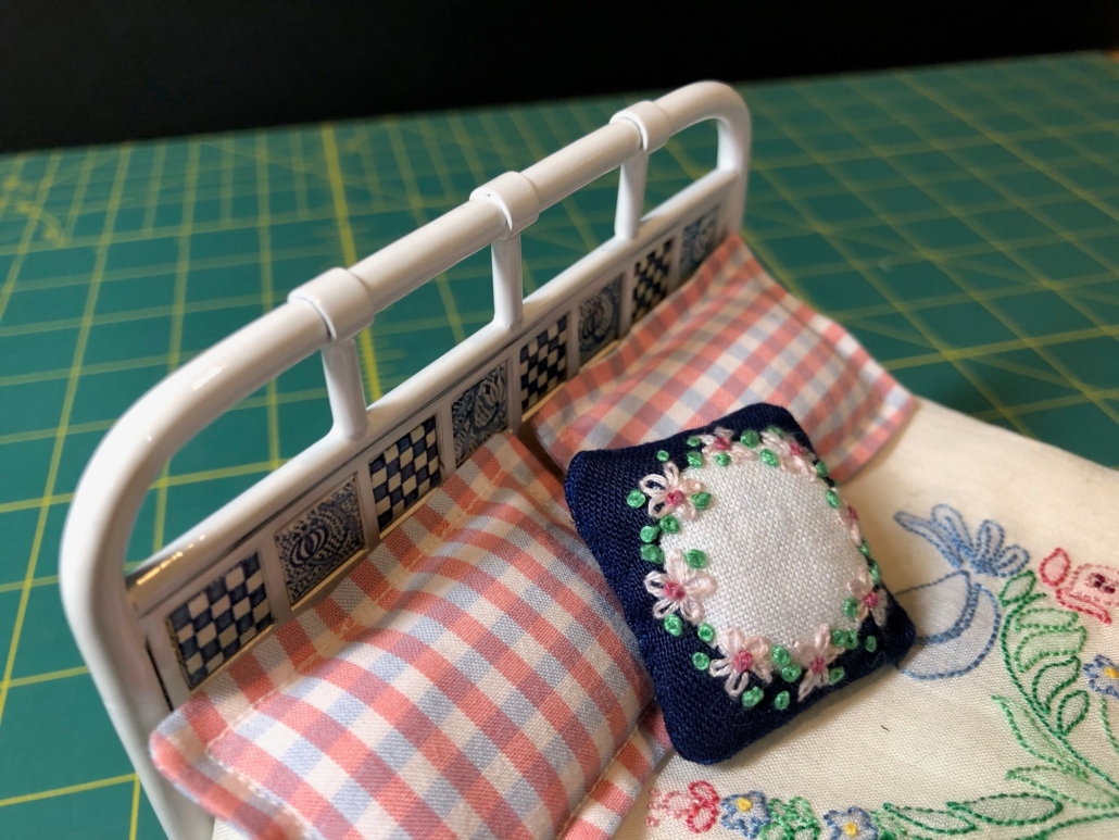
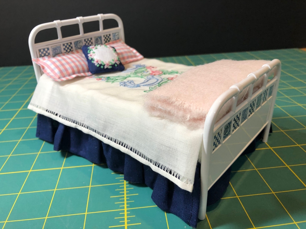
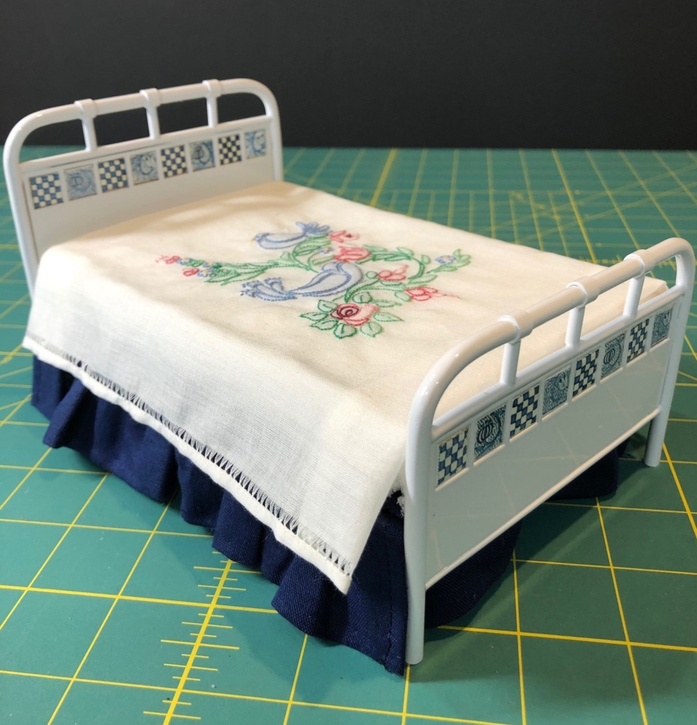
Brass Bed Painted White.

I wanted the third bedroom to feature a brass bed. There were Craftsman metal beds like the beautiful ones I saw in the Gamble House in Pasadena, but none in the Stickley catalogs. I designed this one to show off the beautiful handmade ceramic tiles I bought from the Krugers in Germany (www.tiny-ceramics.com). I had planned the bed to be brass, but the tiles showed off better inlayed in white.

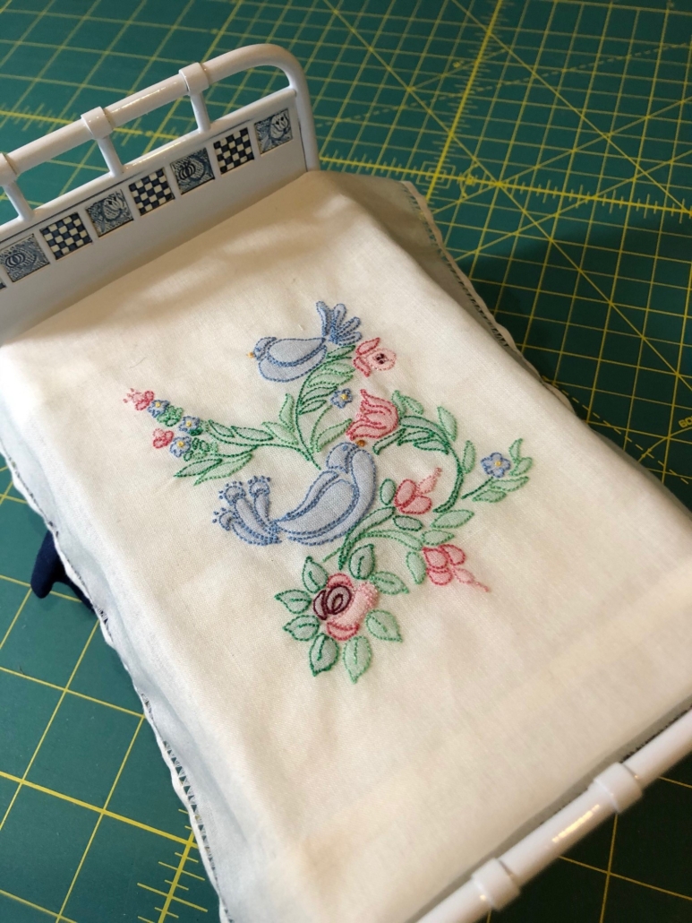
Shadow Work Bed Spread – “Shadow Work” is actually tiny back stitching outlining on the right side with the thread crisscrossing in a closed herringbone pattern on the back that “shadows” through the base fabric. This technique works best on sheers.
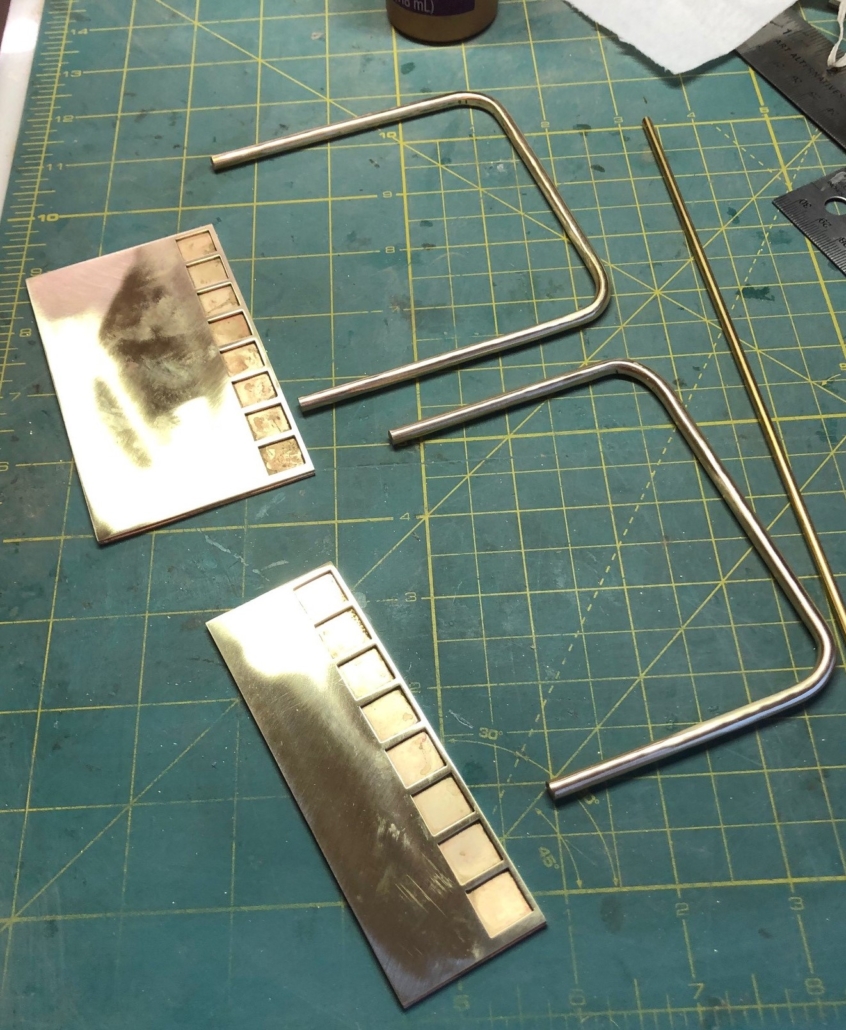
Brass Bed Under Construction
Brass Bed nearly complete

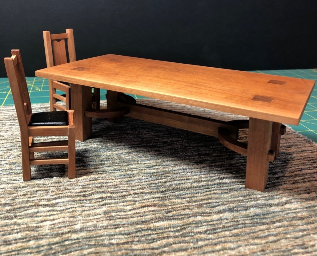
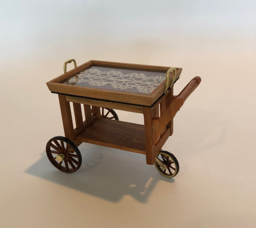
The transition between the living and dining room in my city house is under construction, both in fact and in my head! I have imagined a colonnade of some kind, a half-partition, to agree with Stickley’s idea that a home should not “be a series of cells, room upon room, shut away from the others”. He even mentions a “great room” concept, not unlike our “open space” preferences today, using as “few entrances and doorways as possible”. Anyhow, as I plan the dining room so it “is enhanced by glimpses of the living room” (per Stickley), I decided to make some dining room furniture for which I finished their scale drawings last year. The tea cart is my own design with a little snippet of my great grandmother’s tatting under the glass on the tray. I’m stalling, maybe, but the living room-dining room transition solution will come to me. Watch this space!

Update: The colonnade design did evolve over a period of months, and I had plenty of time to construct it during a second year of Covid-19. Check it out on “Photo Catch-up” entry posted on January 28, 2022.

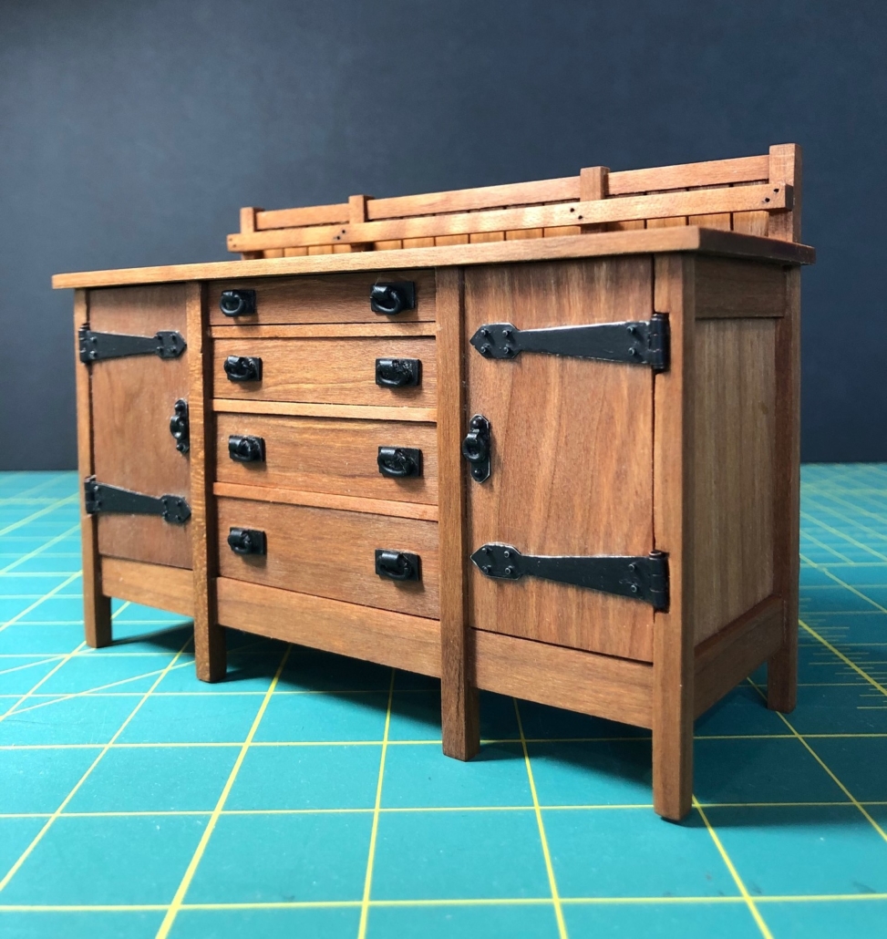
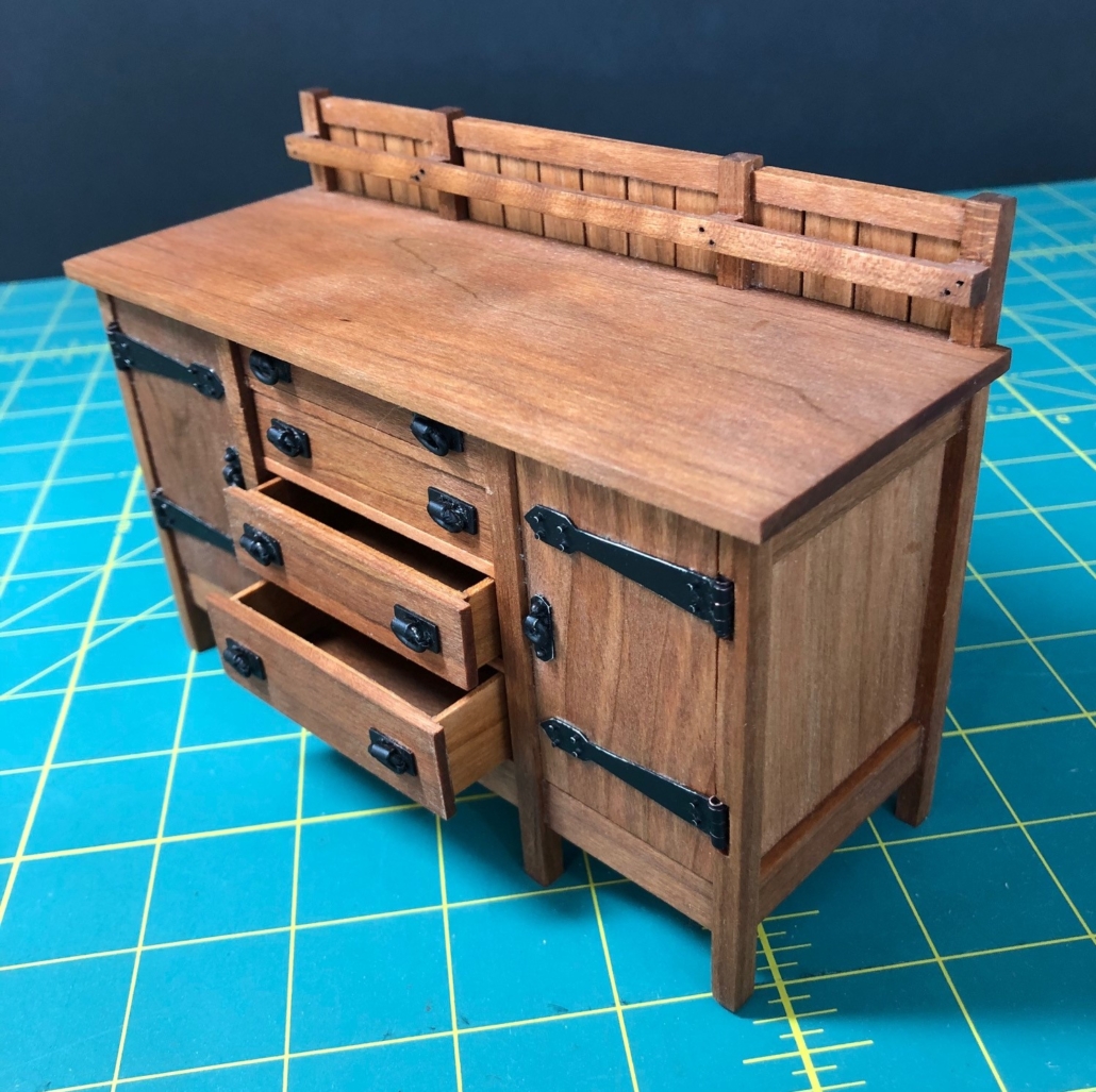
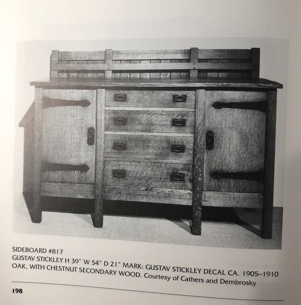
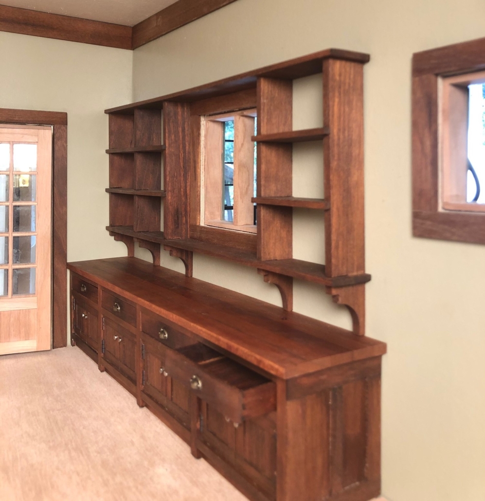
Sideboard #817 Front; Originally the sideboard sold for $84.00 with ooze leather lining in top drawer. In 1907, the hardware on this piece was changed from wooded drawer knobs and pointed strap hinges to the above, but from 1901 on it remained a huge piece of furniture and its price never changed.
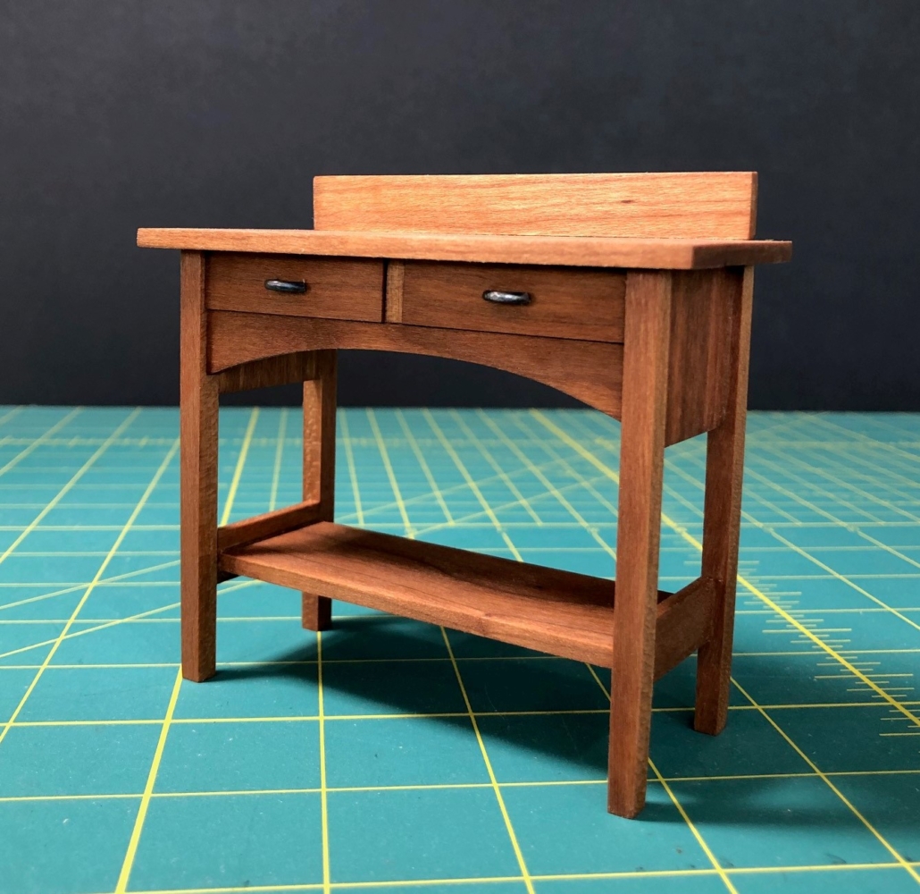
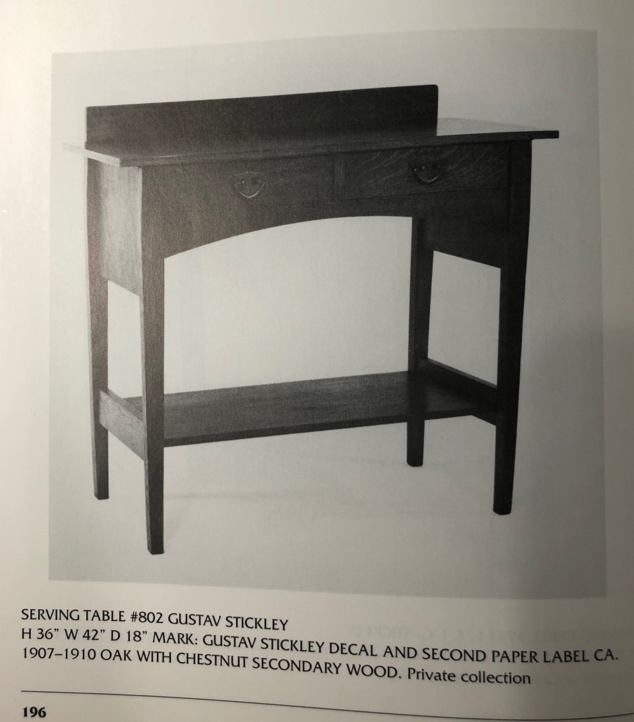
Serving Table #802 ($18.00); The unusual curve on the front apron was probably designed by Harvey Ellis. It first appeared in 1903, changed the hardware to hammered copper or iron in 1905 and was catalogued until 1909.
Tea Cart, my design.
Stickley Serving Table #802
Sideboard with Drawers Open
Stickley Sideboard #817
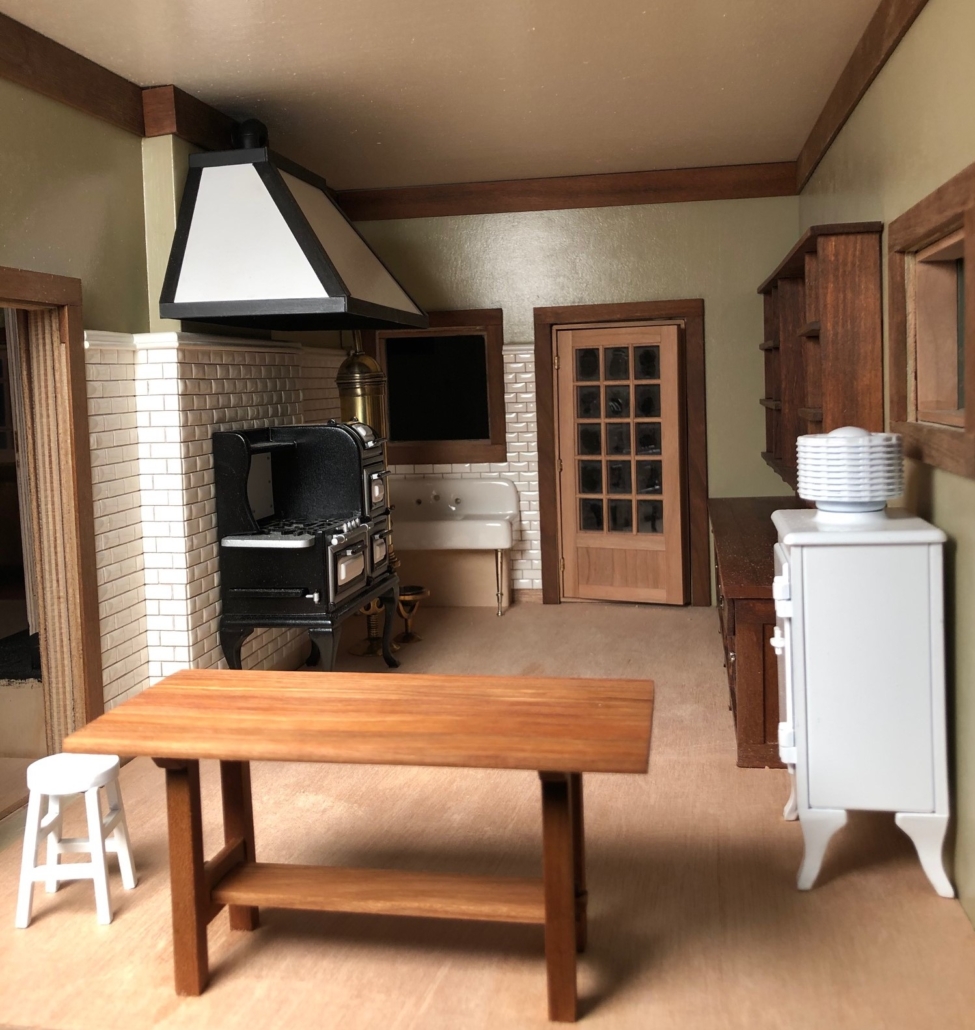
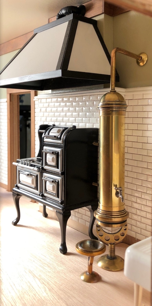
View of full kitchen. Floors and windows yet to be finished.

Researching kitchens for my city house proved challenging. The only thing I could find that Gustav Stickley ever said about kitchens is that they should be “white’” to exude “cleanliness”. It’s true that at the turn of the last century, kitchens were primarily the realm of the help. Thinking of our 1909 Craftsman we bought here on Vashon Island, its kitchen was a nice size but very plain with fir floors, simple double-hung windows and a narrow butler’s pantry leading to a swinging door into the dining room. There, and throughout the entire first floor, were large rooms with gorgeous inlaid oak floors, leaded windows, lincrusta decorated walls, fine millwork including coffered ceilings, built-in window seats, wainscoting, colonnade to the living room and grand staircase with stained glass windows on its landing. Is that modest kitchen we just left minutes ago in the same house??

So, how to handle my little kitchen? My city house plan was published in the October, 1910 issue of “The Craftsman”, so I’m imagining this house as it might have appeared in 1915. Things were changing fast in the early 1900’s. Stoves and hot water heaters went from wood to gas. Not many houses had electricity in 1915, but an upscale city house like this one might have had light fixtures that were both gas and electric as gas use diminished and electricity became more available and reliable, especially in cities.
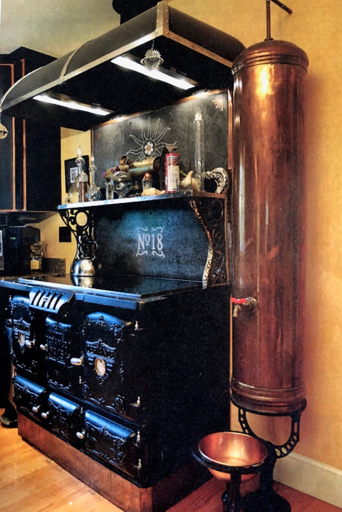
I found many old photos of water tanks attached to both wood and gas stoves for heating water, or standing next to the stove with a gas unit under the tank. Few of them were dated, but I love the look of the tanks and made one for my house with hopes that it’s appropriate for the time. I also bought a wonderful little model refrigerator online with the compressor on top only to discover that it was General Electric in 1927 that introduced the GE Monitor Top, way too advanced for my 1915 house. Would anyone looking at my finished house know? To be historically accurate, should I remove the compressor from the frig and turn it into an icebox? Yet to be decided.

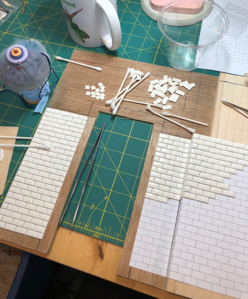
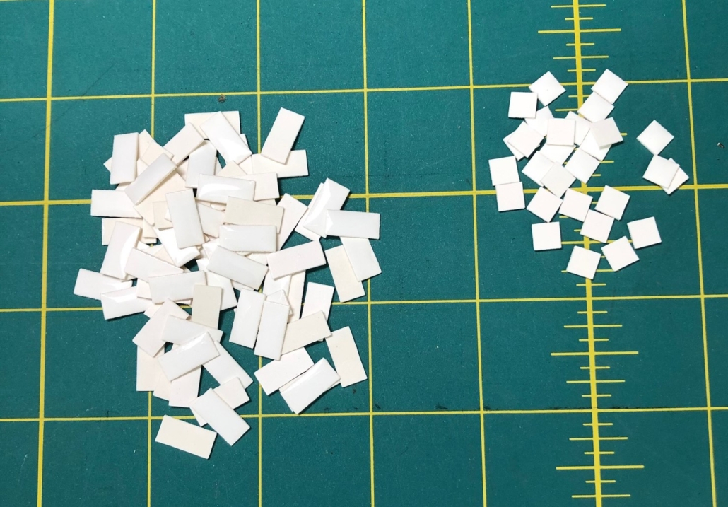
Details: fine materials like marble were sometimes used for counter tops, but usually only in the butler’s pantry. Kitchen counters were wood.  Cabinets and counters replaced the kitchen work tables by 1910 with “toe space” under the cabinets, “very ‘modern’”, by 1915. Cupboards and shelving were made to look like separate pieces of furniture and not connected to the counters. Printed linoleum “rugs” made floor cleaning easier. Walls were painted gloss white or tiled white to emphasize that all-important sanitary look. Subway tile was popular in Craftsman homes. I found amazing hand-made subway tile in Germany by Rita and Horst Kruger (www.tiny-ceramics.com). And I thought gluing tiny bricks was tedious!!! But the look is so worth it.
Tiles Assembly in Progress
Rita and Horst Kruger’s Tiny Tiles
My Version of the Hot Water Heater Inspired by the Magazine Photo Below.
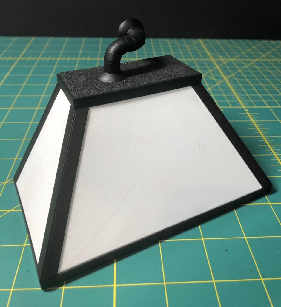
Stove Hood for Kitchen
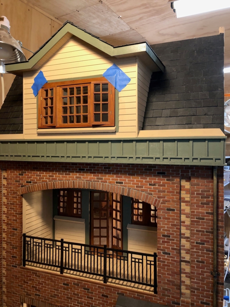
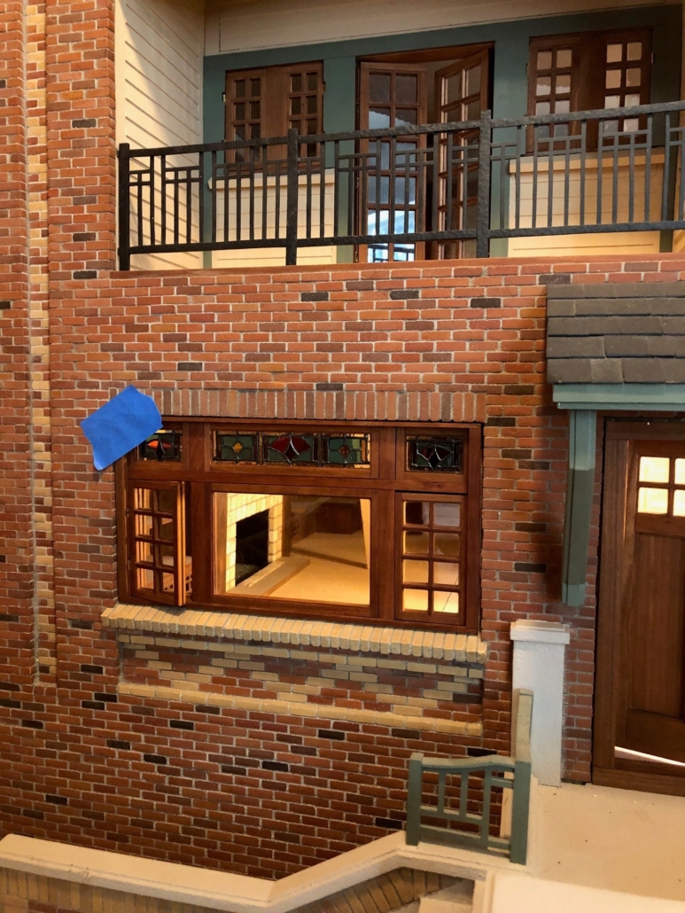
Exterior Almost Complete

None of us will ever forget this spring of 2020. I read recently that it’s like Mother Nature has sent us all to our rooms to think long and hard about our bad behavior. Covid 19. The optimist in me thinks that after that long and hard thinking, we are all going to come out of this enlightened and will want to continue in a better direction as an honor to those we’ve lost. With some inspired leadership we just might.

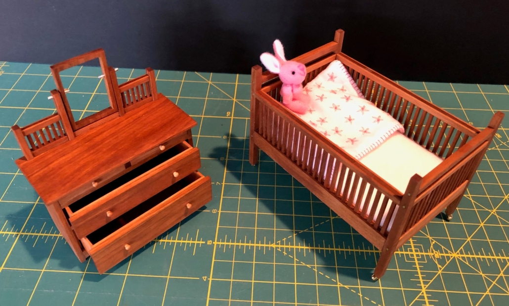
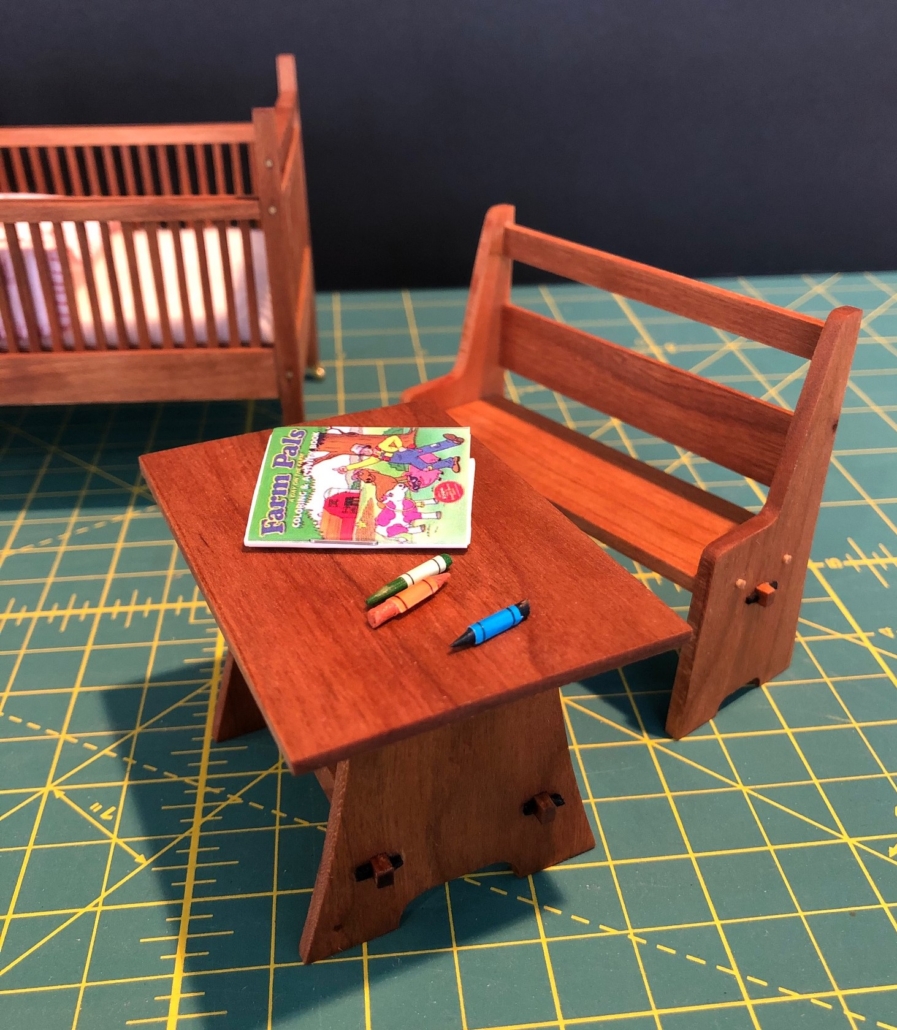
Nursery Furniture: Child’s Dresser #921 ($20.00) and Child’s Bed #919 ($16.00).

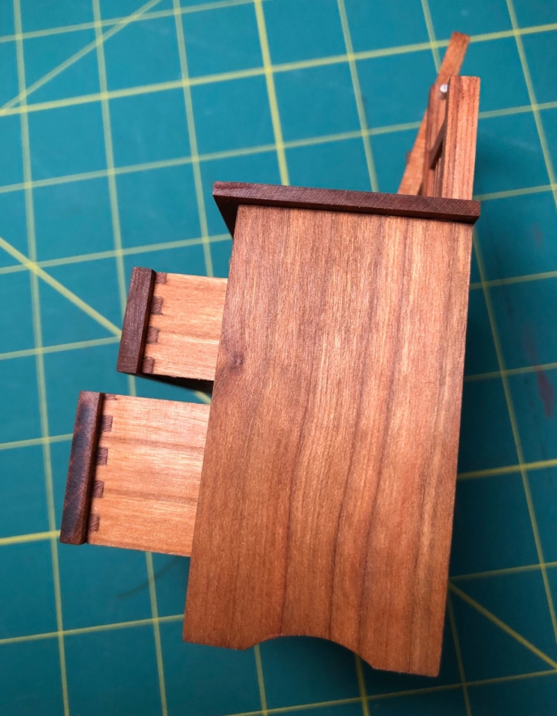
Gary and I are really OK at home with lots of projects to keep us busy. Of course, most mornings I head down to my shop to work on my little house, and he doesn’t see me until dinnertime. There’s been progress. The exterior is finished except for half of its 20 casement windows and a couple of exterior French doors. However, it may be the stress of the world’s situation that has caused me to set aside (tedious) windows and doors temporarily with all their tight measurements, tiny hinges, knobs and handles. I’ve been concentrating on furniture, most recently baby furniture for the nursery. It’s cute and comforting…like the embroidered miniature baby blanket. The little dresser will get its mirror when my Seattle glass store reopens. These are my first attempts at dovetailed drawers, and after some trial and error(sss), they’re acceptable. Not that anyone will see them when the drawers are closed, but it’s all about the challenge and my respect for Stickley’s beautiful furniture designs ( that ALL had dovetailed drawers for sure!).
Dovetail Detail on drawers of Child’s Dresser
Child’s Table #639 ($8.00) and Child’s “Settle” #211 ($8.00)

Gustav Stickley, I read somewhere, designed houses so that the fireplace was the first thing that someone entering the house would see. Not too close to the entry to cause drafts into the main room, but close enough to invite the person inside to enjoy the warmth and shelter the fireplace promised.

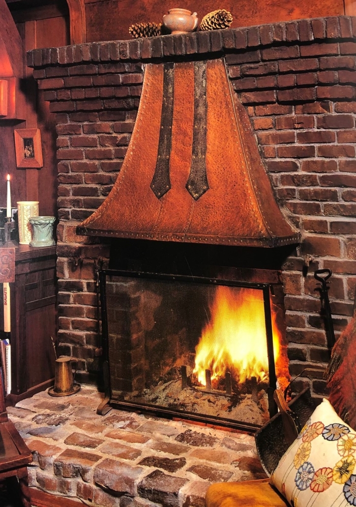
Photograph from “Inside the Bungalow”

One of my favorite books about America’s Arts & Crafts Interiors is “Inside the Bungalow” by Paul Duchscherer & Douglas Keister. In it they refer to the fireplace as the “symbol of hearth and home.” Years ago, I saw a photo in that book of a fireplace that never left my mind, and I knew a fireplace like that one would end up in my miniature house somewhere, someday. Now, this house of mine has four fireplaces, in the living room, master bedroom and studio, three rooms that are located one above the other in the floorplan sharing a common chimney. The fourth is in the dining room on a wall with the kitchen stove directly on the other side. They share a chimney that goes up a chase through the middle of the house to the roof above the third floor. I’ve researched this house plan as much as I can and find no indication about how it was heated.  It’s possible that there was a coal fired boiler in the basement, but there are no specifics on the plans for plumbing and heat registers associated with a hot water or steam heating system. It’s also possible that heating was left to the family’s fire maker and the home’s four fireplaces.

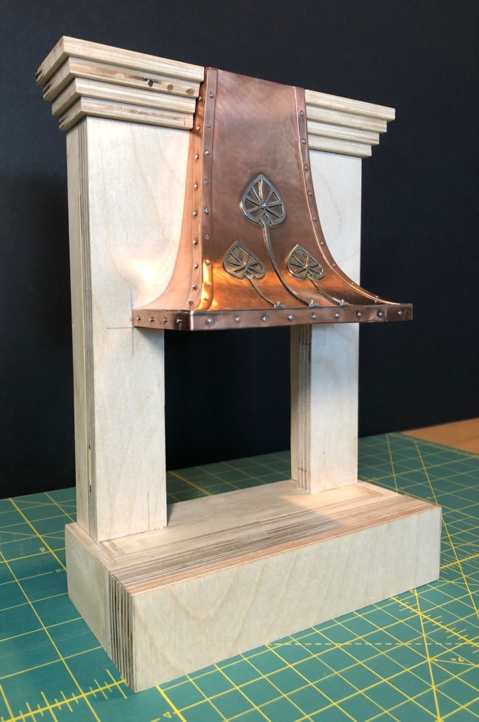
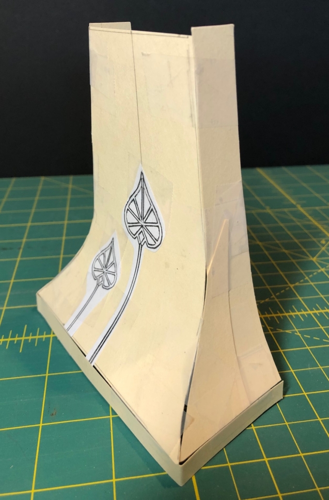
This fireplace will be in the dining room. Based on the photograph, I made a cardboard model of the copper fireplace hood, with lots of trial and error! I hand hammered the copper sheet stock before cutting the pieces and silver soldering them together. The fireplace will eventually be covered with a pinkish brick and slate on the hearth. Stacey’s Masonry is closed now due to the Covid 19 pandemic, and my brick order is on hold. “Sheltering in place” has given me a lot of time to devote to my house and its furnishings, but I will have to put the bricking of this fireplace off for a while. (To see this finished fireplace, check out the “Photo Catch-up post.)

Hood on Unbricked fireplace
Cardboard Hood Pattern
Hand-wrought Copper Fireplace Hood
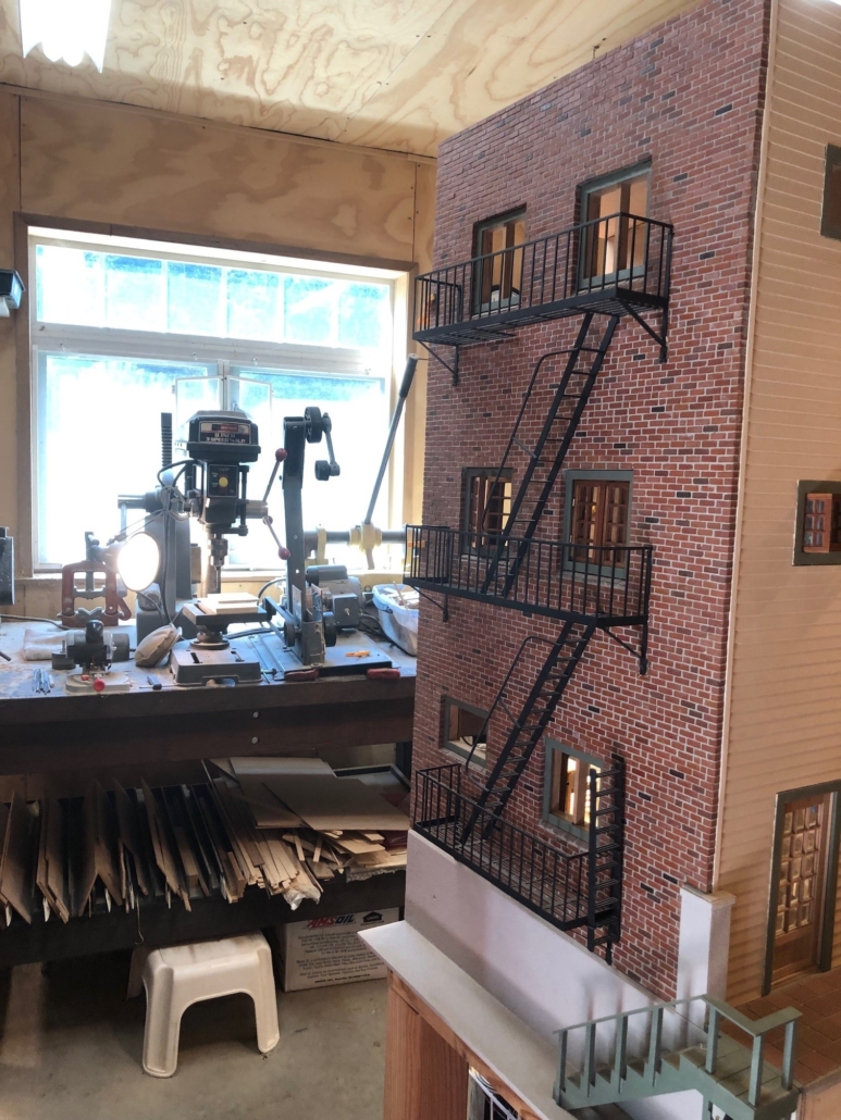
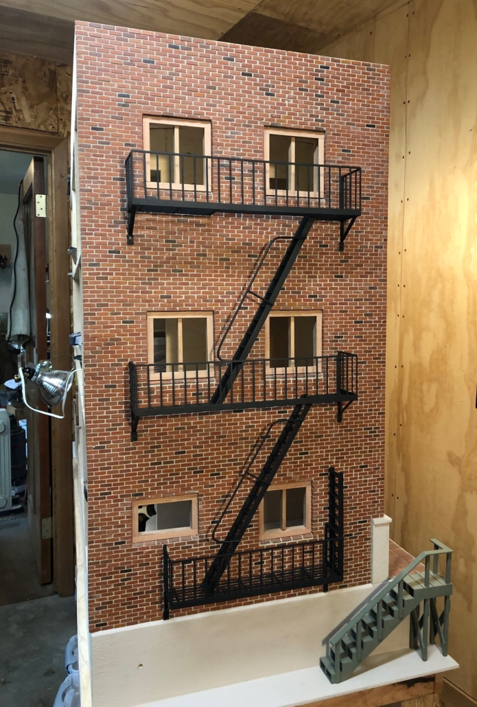
Finished fire escape

After more than a month of dealing with tiny tweezers, rulers, PVA glue, sharpened pencils, sand paper, little brass jigs made to help cut bricks in perfect halves, Q-tips etc. etc. on the façade of my city house, I debated long and hard about whether the rear wall which faces a back alley would also be brick. Long and Hard!! Would my imaginary owner/builder decide to trim costs and maybe shiplap that back wall to save money? (Stickley’s plans left many decisions up to the home owner.) I mean, who would see it except for the city garbage collector? After watching hours of “Friends” re-runs with my granddaughter, the idea of a fire escape came to mind. The decision to brick that rear wall was made. How cool would that look? Done!

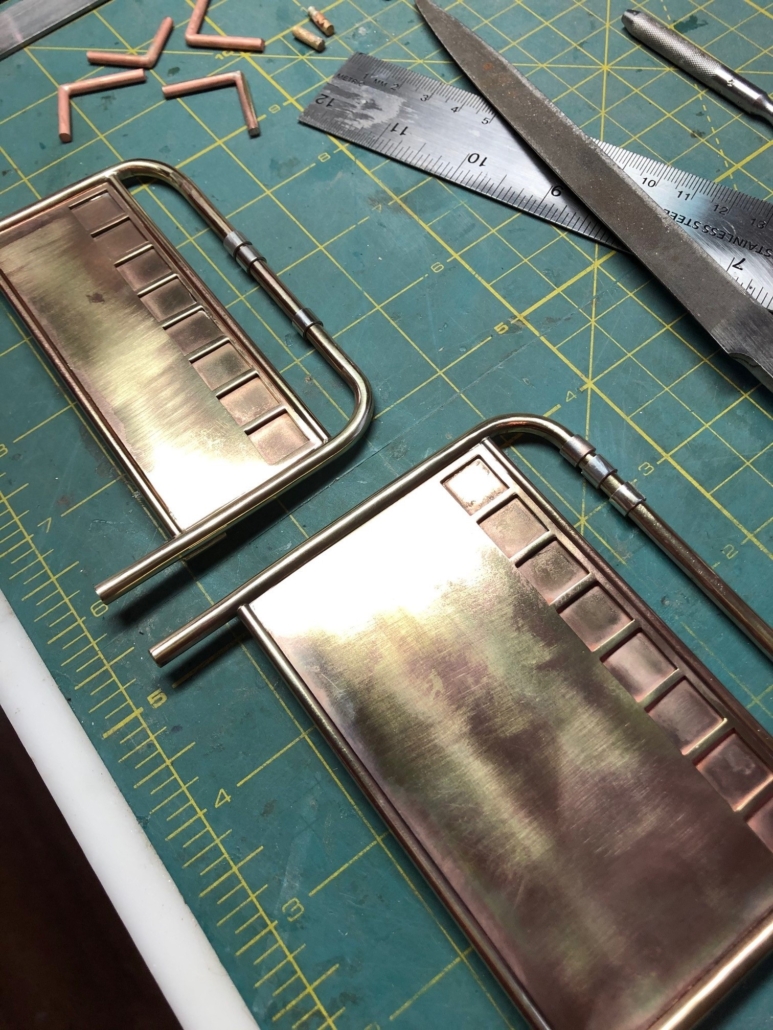
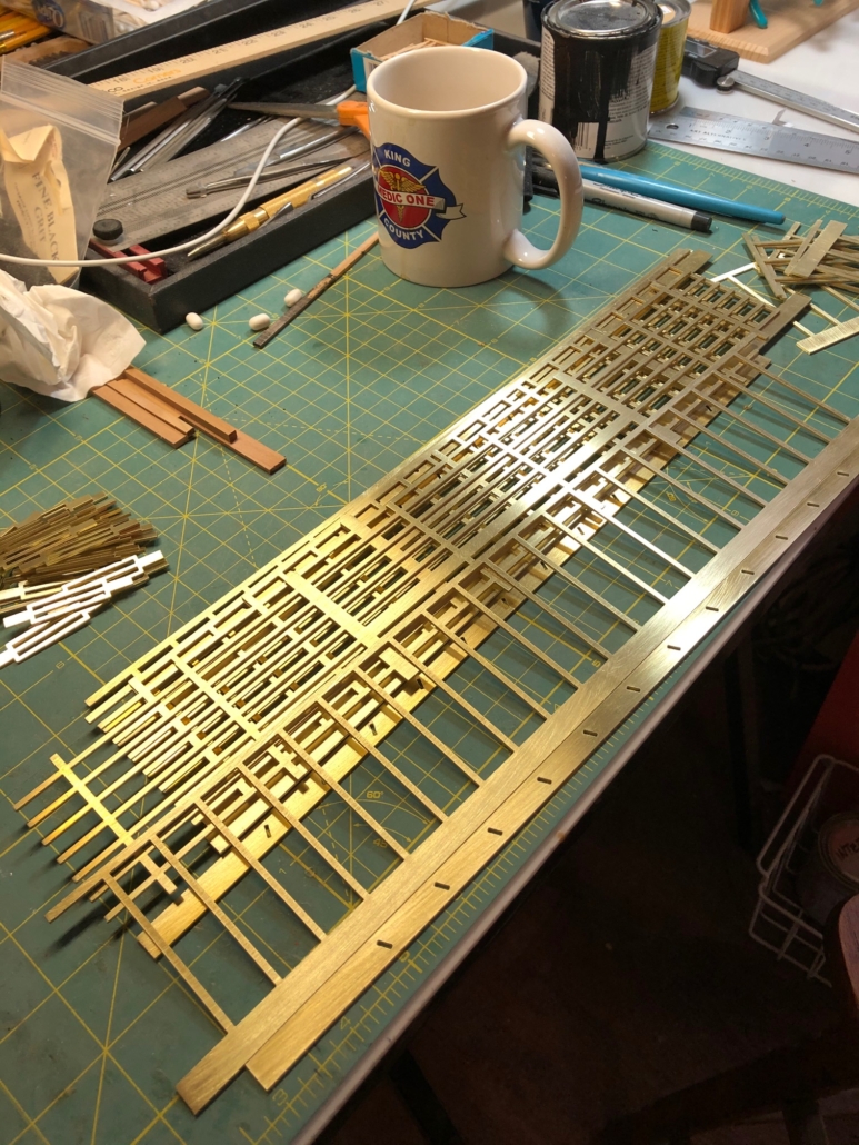
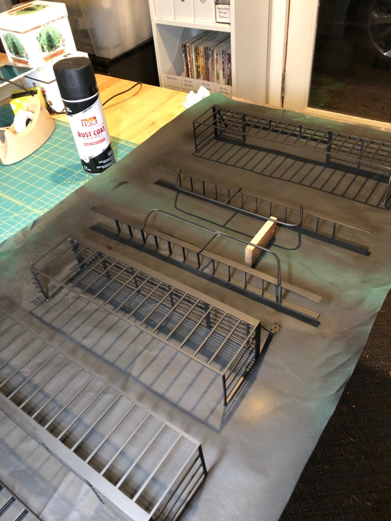
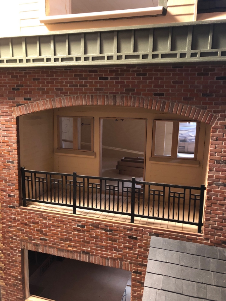
I bricked the entire wall. It was much easier and faster than the front wall that had indentations, decorative brick patterns in those recesses and curved porch elements. Tricky. With the rear wall bricked, then came the metal components. On the façade, I had hand cut the (“sleeping porch”) balcony railing by hand with my jeweler’s saw out of 14ga brass. It turned out fine but was a real physical effort. I couldn’t imagine cutting all that brass by hand for the fire escape that I had designed. Bob Powell of Vashon (Metal@MetalCreature.com) advertises in our local Beachcomber newspaper that he does “art fabrication” (and a lot of other things) with abrasive waterjet machining. I drafted the panels, Bob cut my pieces, and all I had to do was silver solder everything together. After sand blasting, painting and mounting, I’m more than happy with the results.       

Cut brass fire escape pieces
Painted brass pieces
Hand-cut front facade “sleeping porch” railing
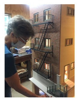
A rare photo of me (because I take almost all the photos)!